
Realogy, the leading global real estate services firm, with subsidiary brands such as Century 21, Coldwell Banker, Corcoran, Sotheby's, Cartus, ERA, and Better Home & Gardens, hired my Mindtree team to build a metrics dashboard for assessing their marketing campaign performance. We had to identify relevant KPIs and design an interface that enabled Realogy's marketing team to easily understand data and trends.

User Research I interviewed different Realogy stakeholder-users, understanding their needs, and began collating research for persona creation.
Data Analysis I assessed numerous existing Realogy CSV and Excel spreadsheets, and worked closely with Jayashree (Mindtree data scientist) to understand the different groups' reporting metrics and needs.
Data Visualization I was the sole designer identifying and creating dashboard visualizations. I also designed charts for upcoming features that they do not currently have data for. I worked with Jay (Mindtree technical architect) to ensure that my visualizations were supported by Microsoft's Power BI software, which is how our application will utlimately be deployed.
Dashboard Design As the sole product designer, I expanded on a consistent design system that I had begun from a previous Realogy project, and established site architecture, information hierarchy, modules, and components for various personas viewing the dashboard.
UI & Art Direction I created the visual UI look and feel, set the typography and palette, and applied these elements throughout the prototype.
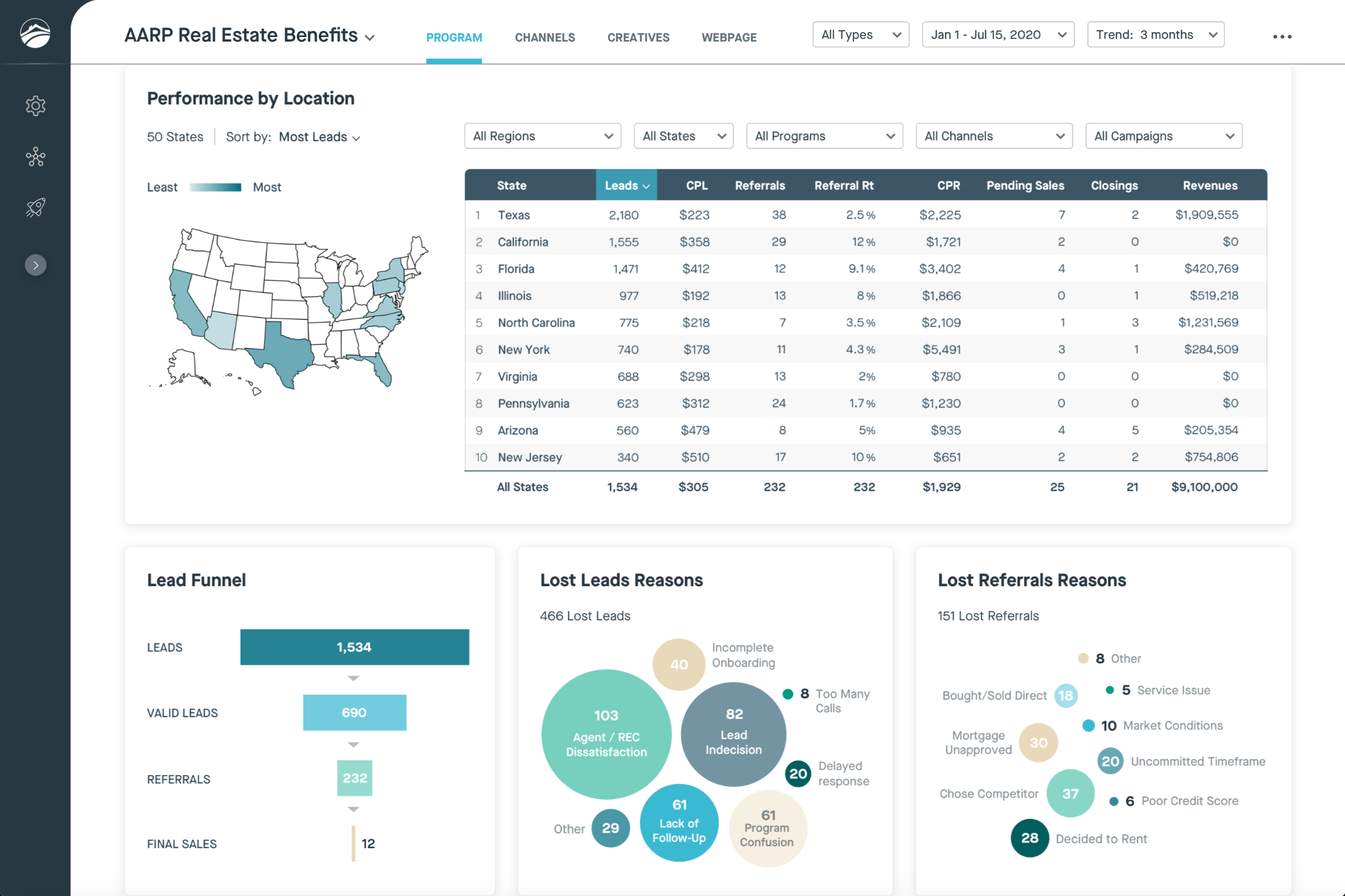
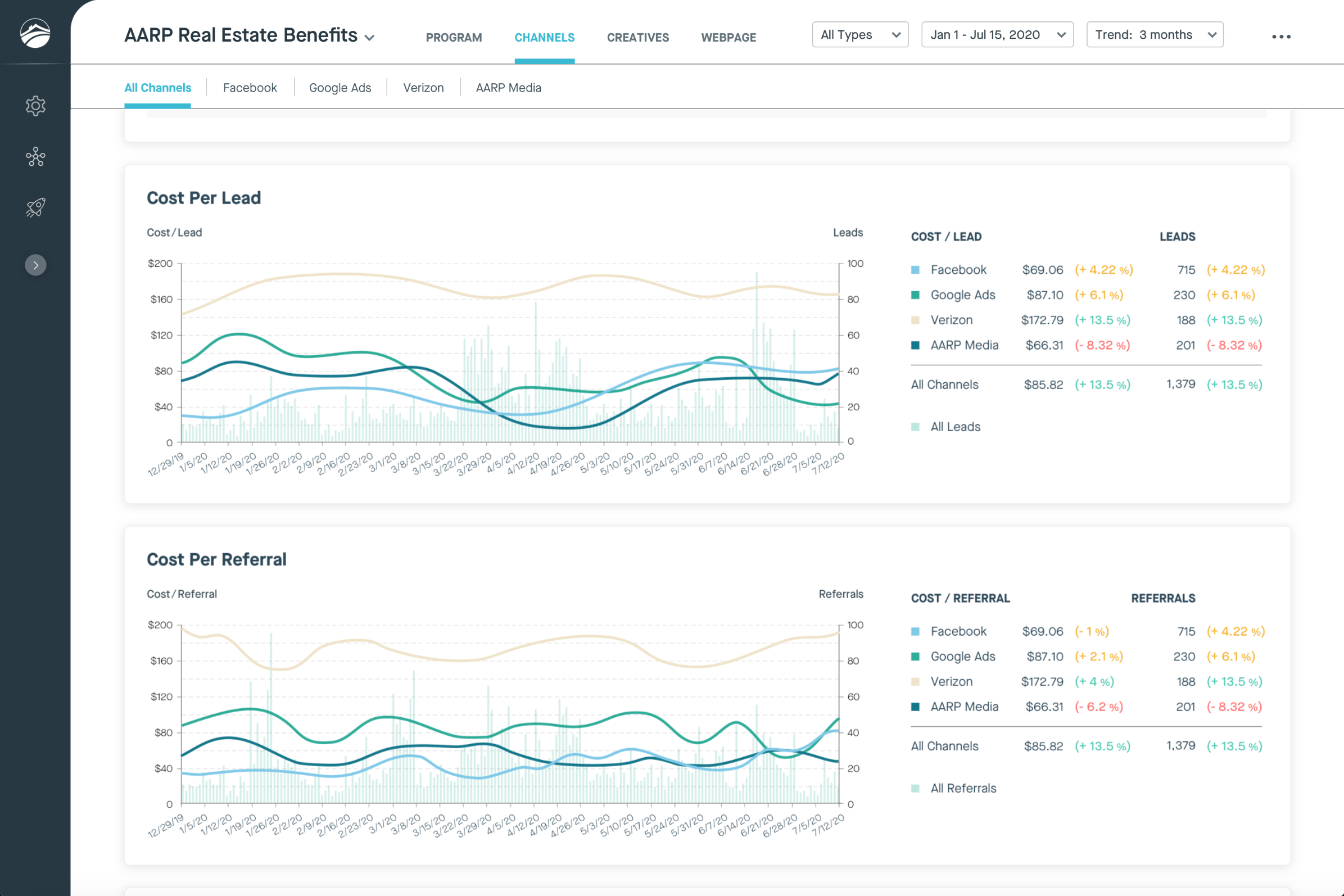
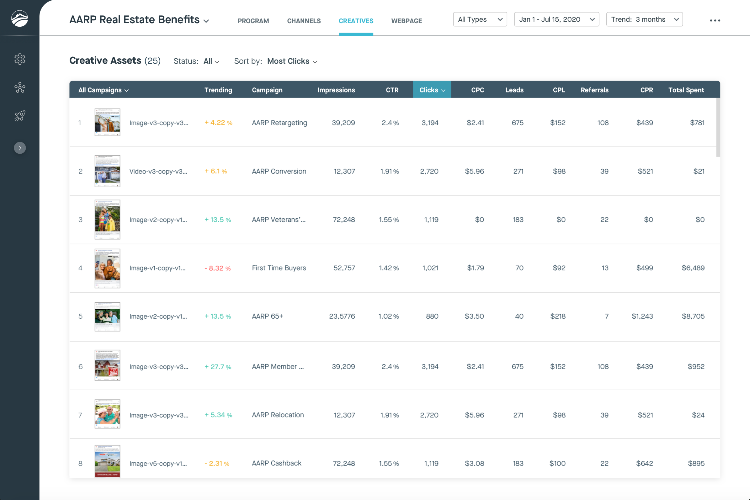
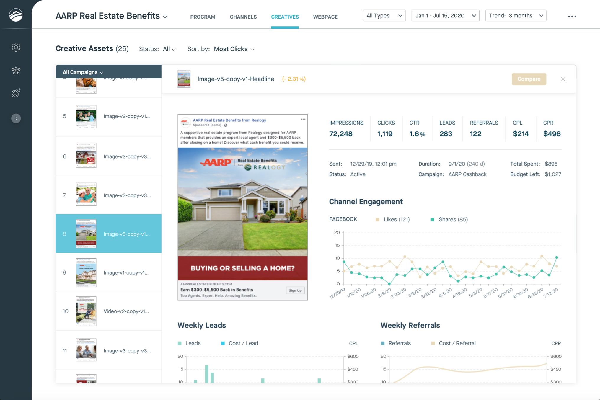
Since Realogy marketing and campaign teams currently rely on numerous CSV and Excel documents and spend excessive time analyzing their data, the two main goals of this project were: (1) to shortlist relevant data, and then (2) to present the data in a simpler and more easily digestable way.

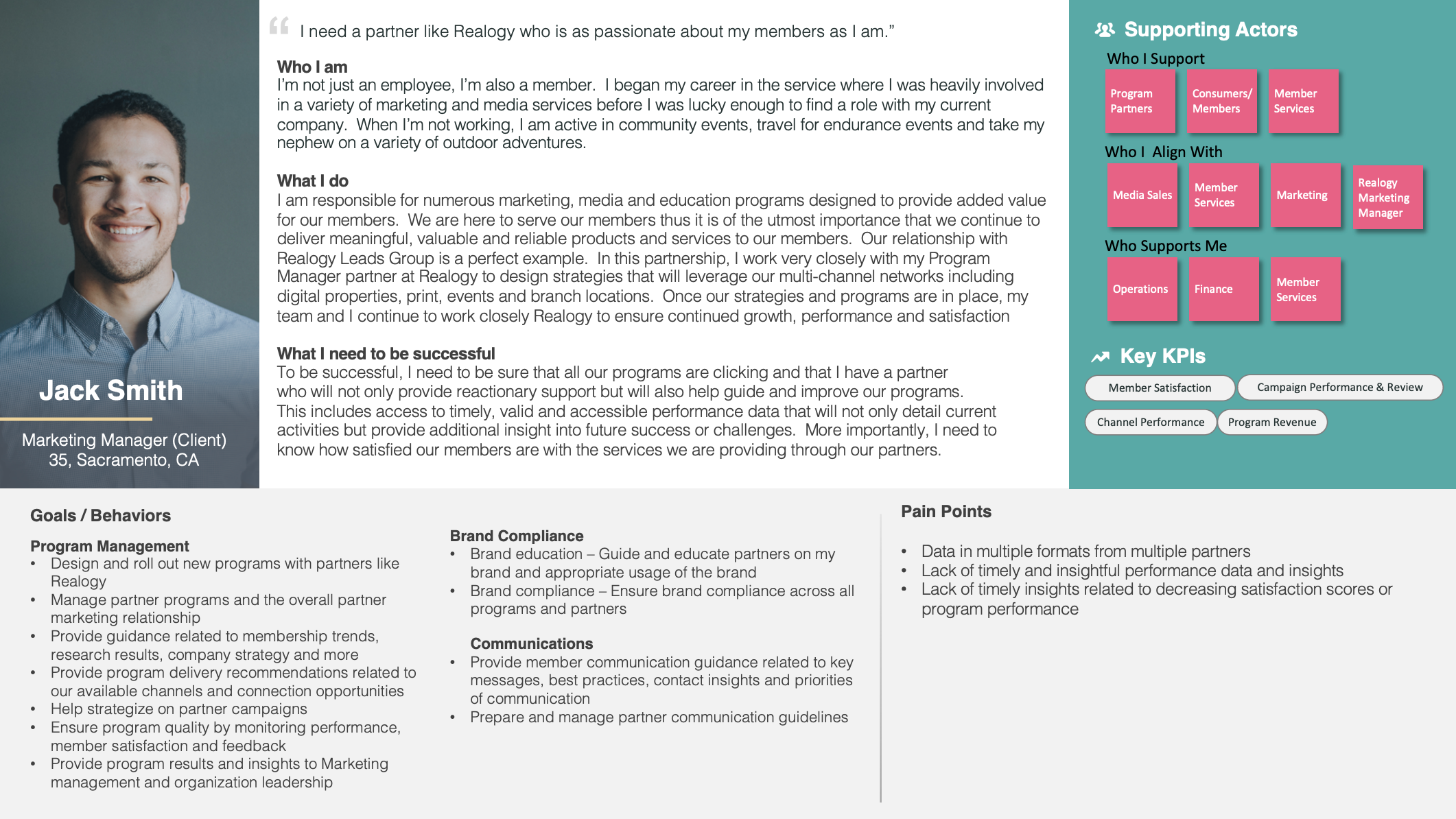
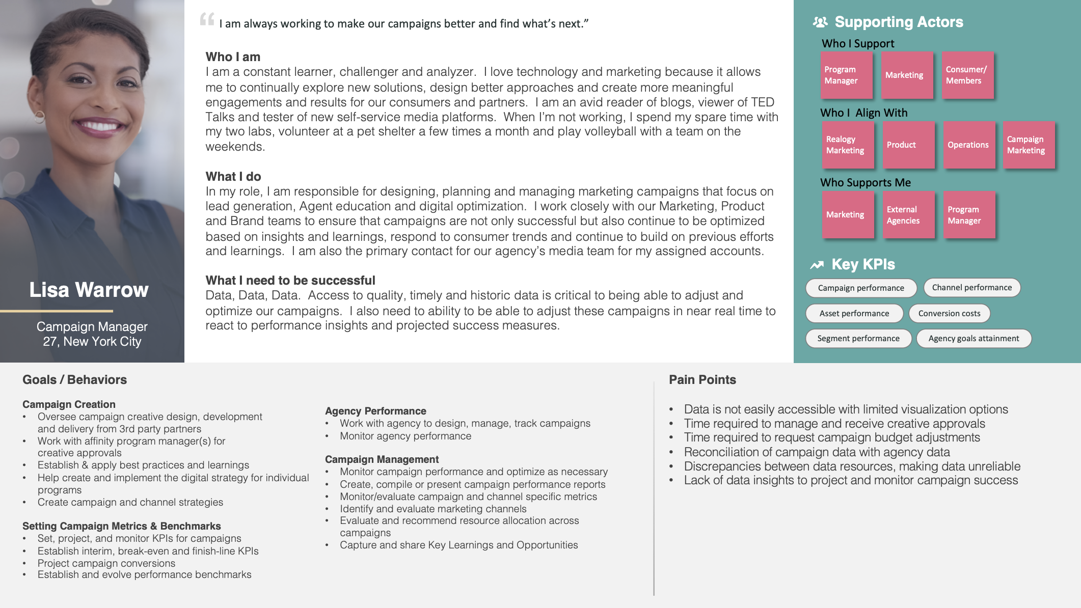
Through user interviews, I identified persona responsibilities, needs, and success metrics for the three main dashboard users, as shown below: (1) program manager, who analyzes leads performance from Affinity programs such as AARP, (2) marketing manager, who analyzes overall channel (such as Facebook or Google ads) performance, and (3) campaign manager, who analyzes specific email or advertising creative performance.
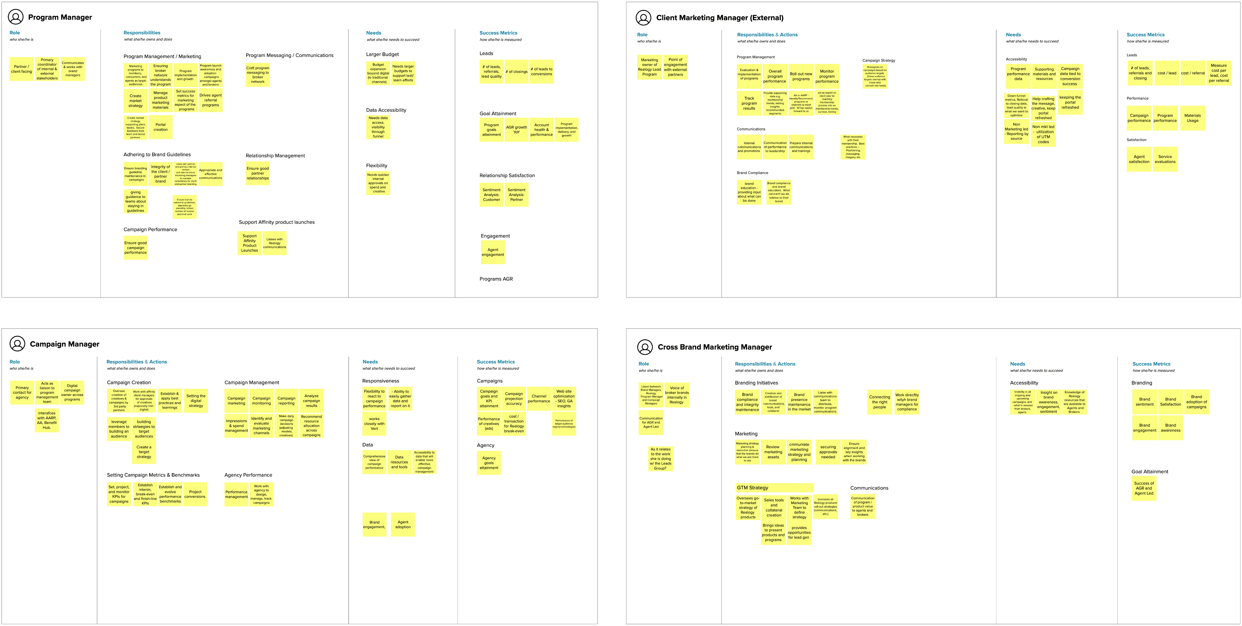
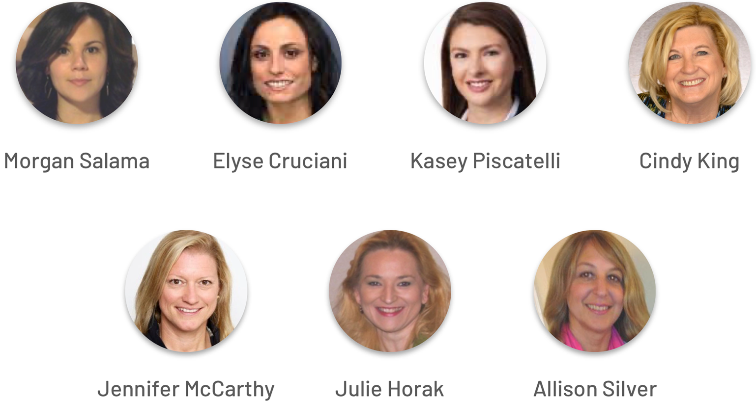
My colleague Kari (Mindtree experience strategist) aggregated and expanded on my user research, creating final persona deliverables with graphics, as shown below.
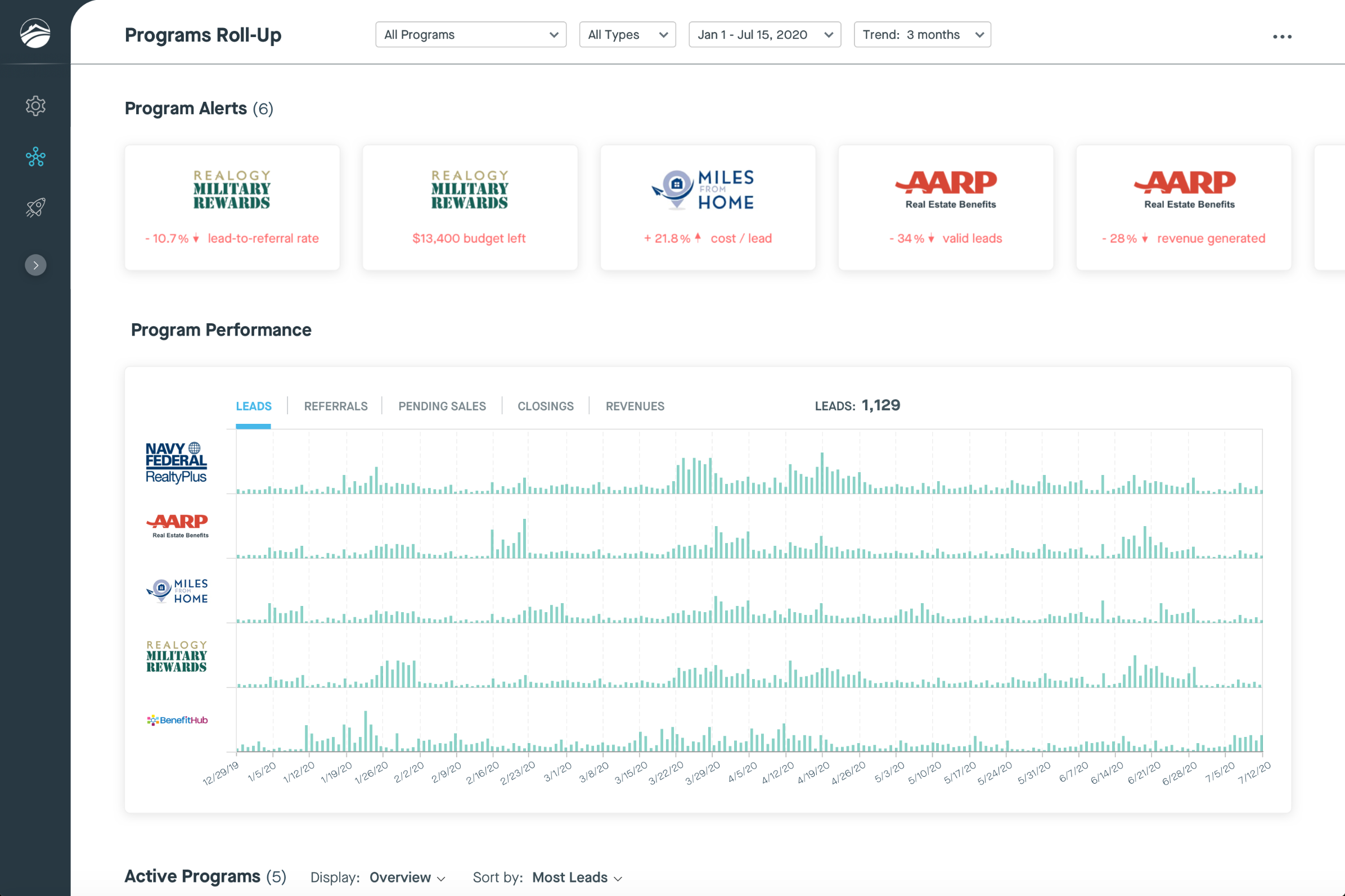
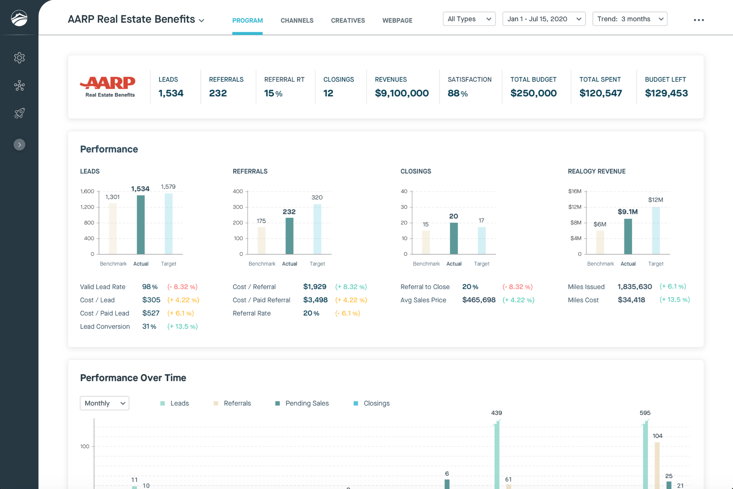
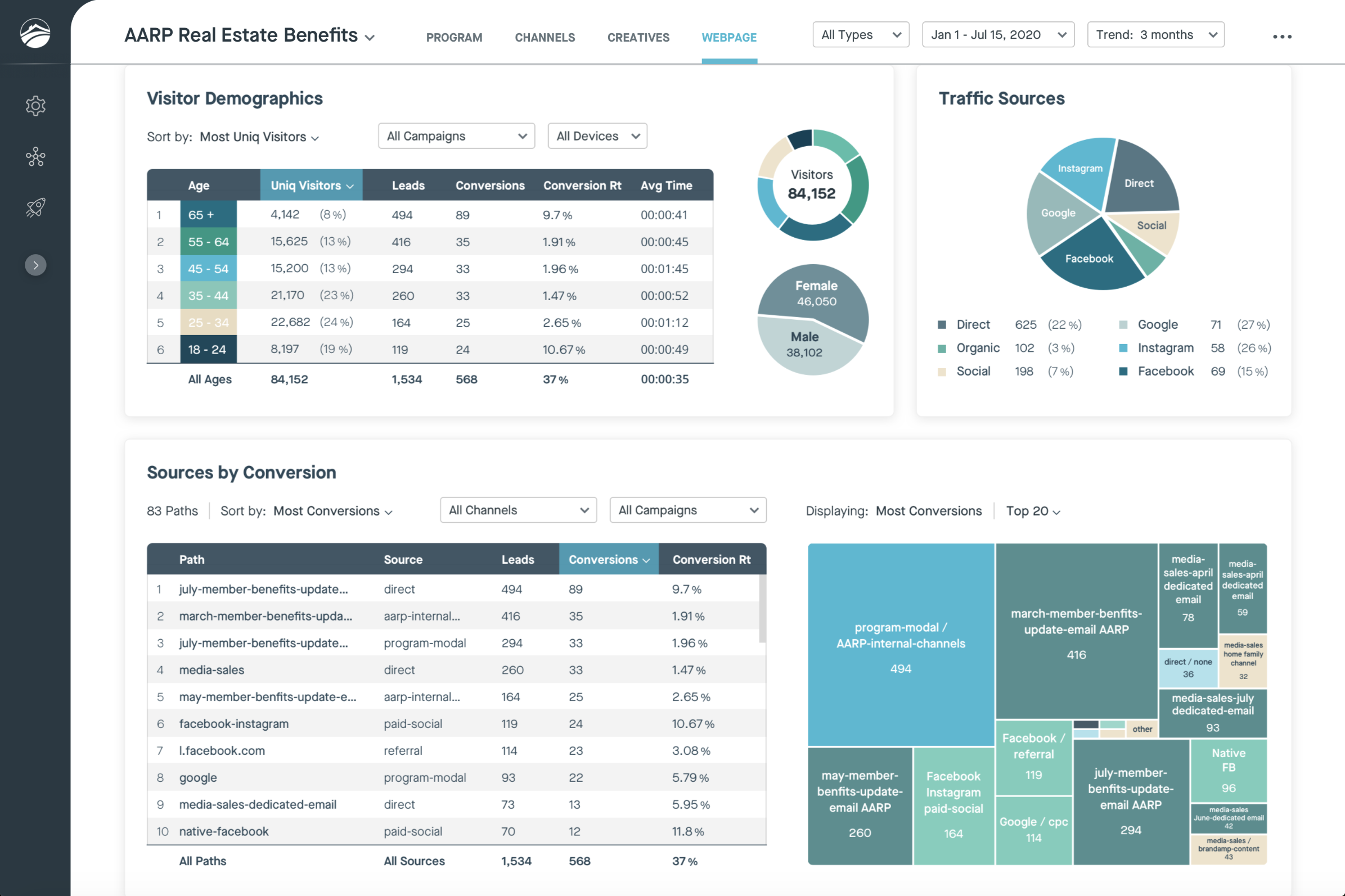
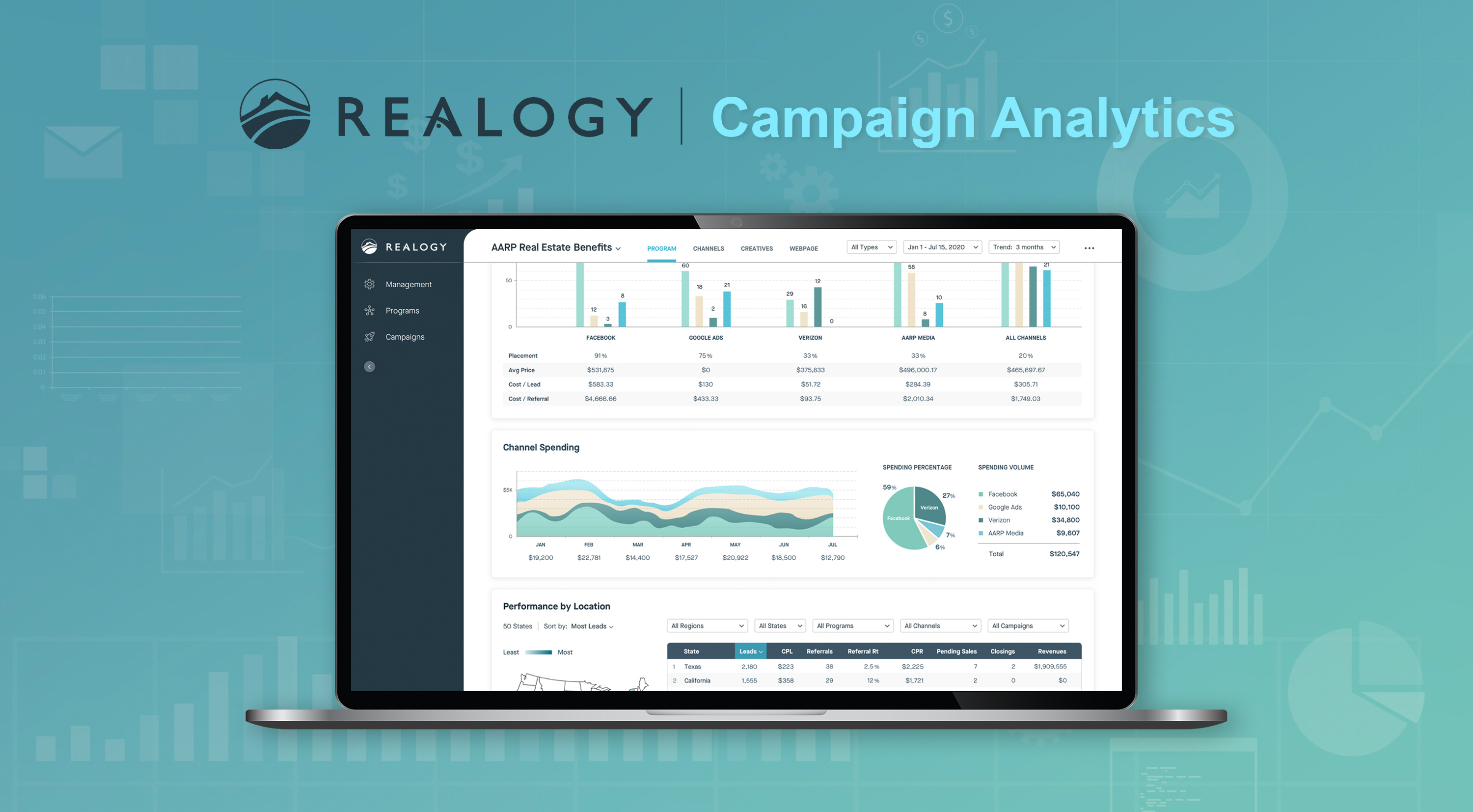
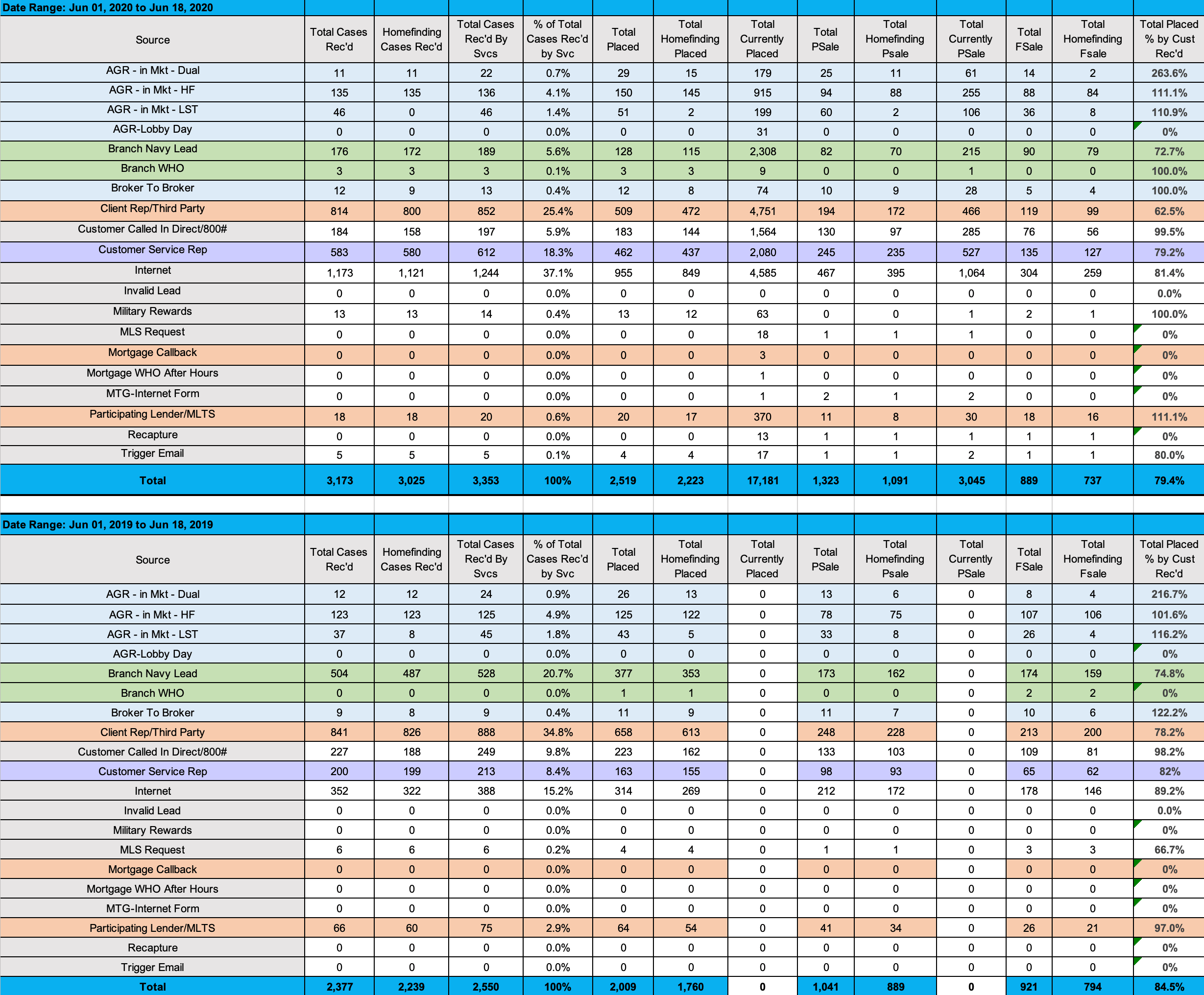
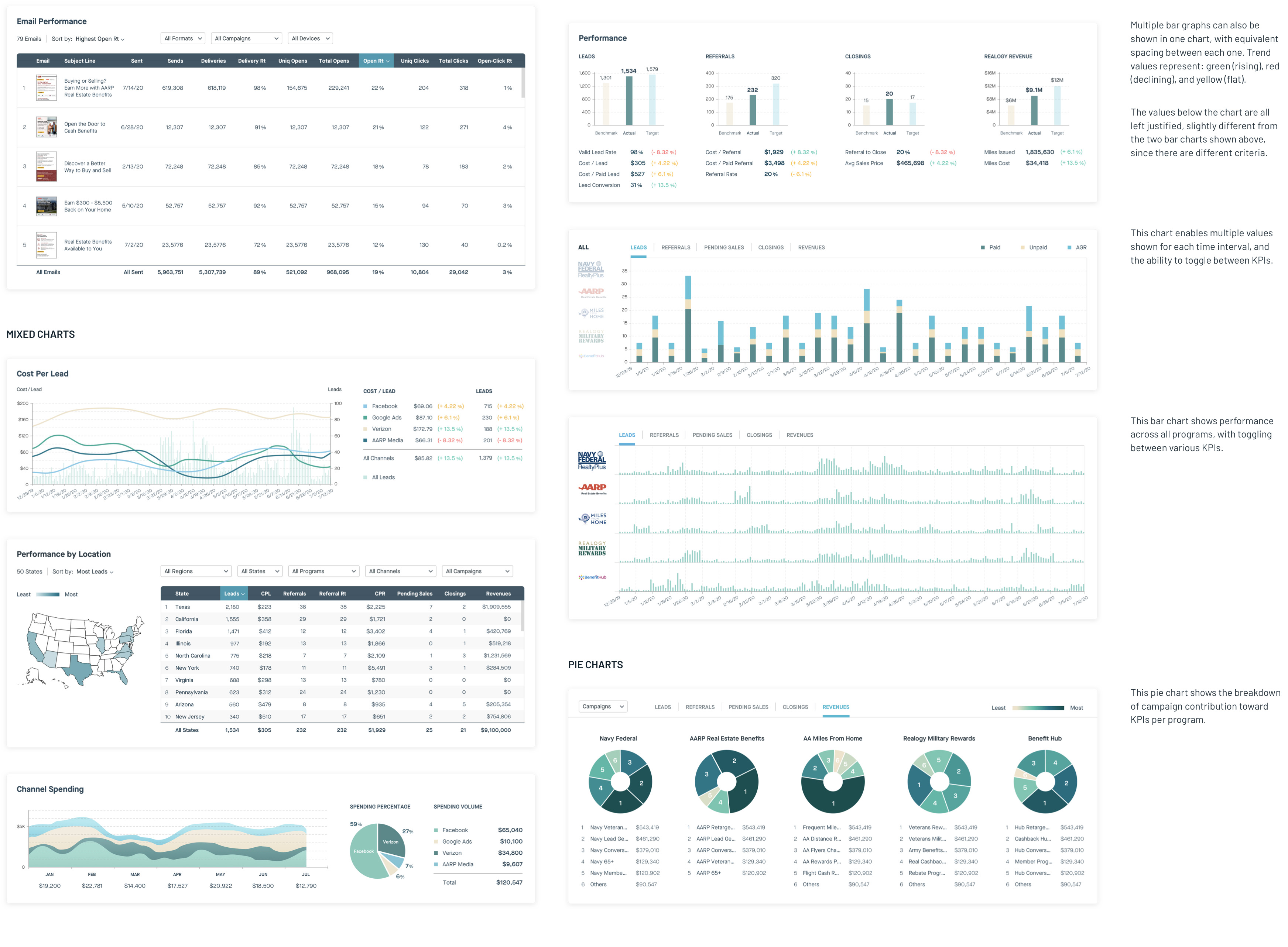
Realogy marketing and campaign teams worked off of CSV and Excel documents, as shown in the examples below. The numerous columns and rows in these spreadsheets made it difficult to distinguish values and trends. Thus, I adopted various visualizations that best represented certain data points, and created a palette and design system for enhanced user engagement, as shown in the Final Prototype section.

Based on Realogy stakeholder goals and user research, my colleague Jay (Mindtree technical architect) documented required MVP features and functions (as shown below). I adhered to this document closely, ensuring all specifications were captured in my prototype. Furthermore, Jayashree (Mindtree data scientist) compiled a metrics document (shown further below), specifying prioritized and required data points, as ranked by Realogy stakeholders. Values between 1-3 are shown, with "1" indicating "nice to have" and "3" representing "must-have". I was able to include even many of the "nice to haves" in my prototype.


From the numerous Realogy program spreadsheets, I extracted the required data points from Jayashree's metrics document and Jay's features list. Throughout countless revisions, I devised pie charts, bar charts, stacked bar graphs, line graphs, histograms, area graphs, bubble maps, density plots, and Marimekko charts to represent different types of data. I consulted with Jay to ensure these visualizations were compatible with Microsoft Power BI software. I also designed scalable modules and components, accounting for future features that will be shown through the dashboard.
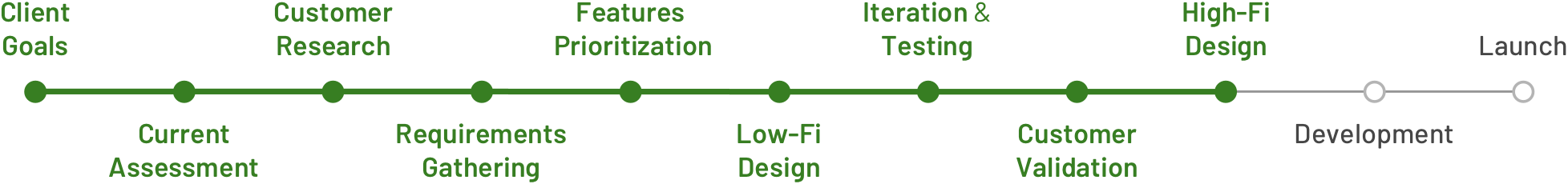
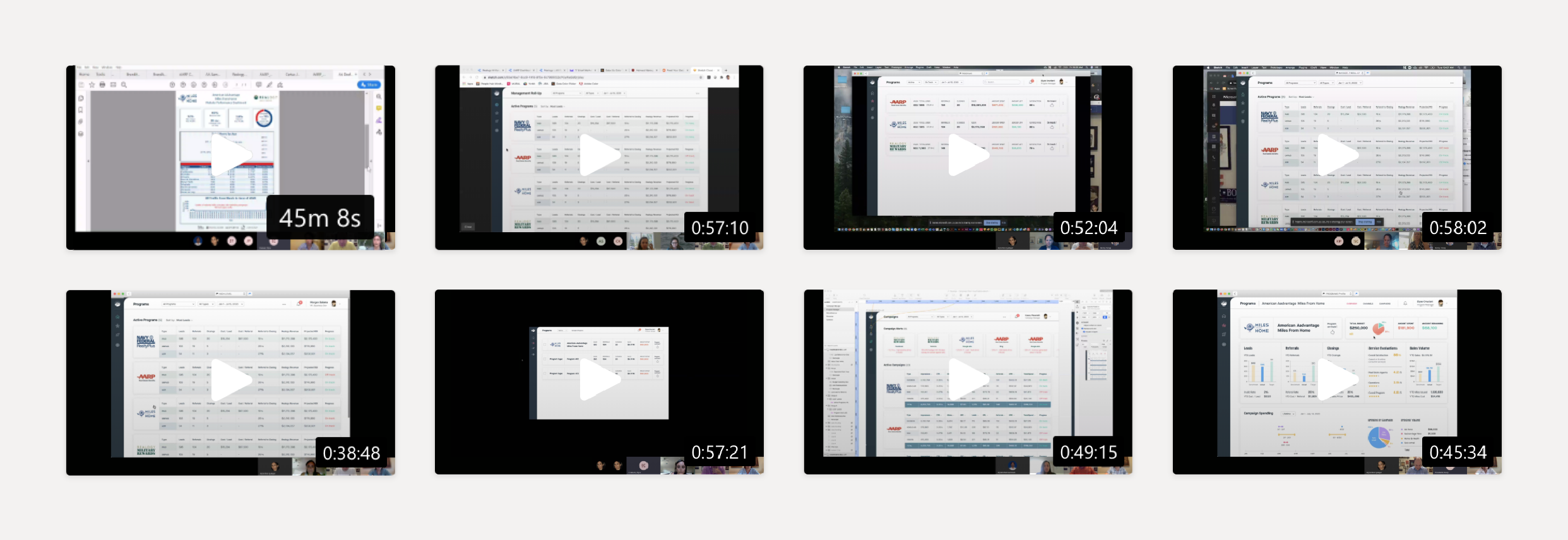
I had an agile testing approach, where I continuously developed and iterated on my protoype, with user reviews and feedback every couple of days. I worked closely with Realogy users - the marketing and campaign teams (as shown below), to ensure my designs address their needs and are scalable long-term. We held 11 comprehensive Zoom review sessions, each between 40-60 minutes in duration (as shown below).
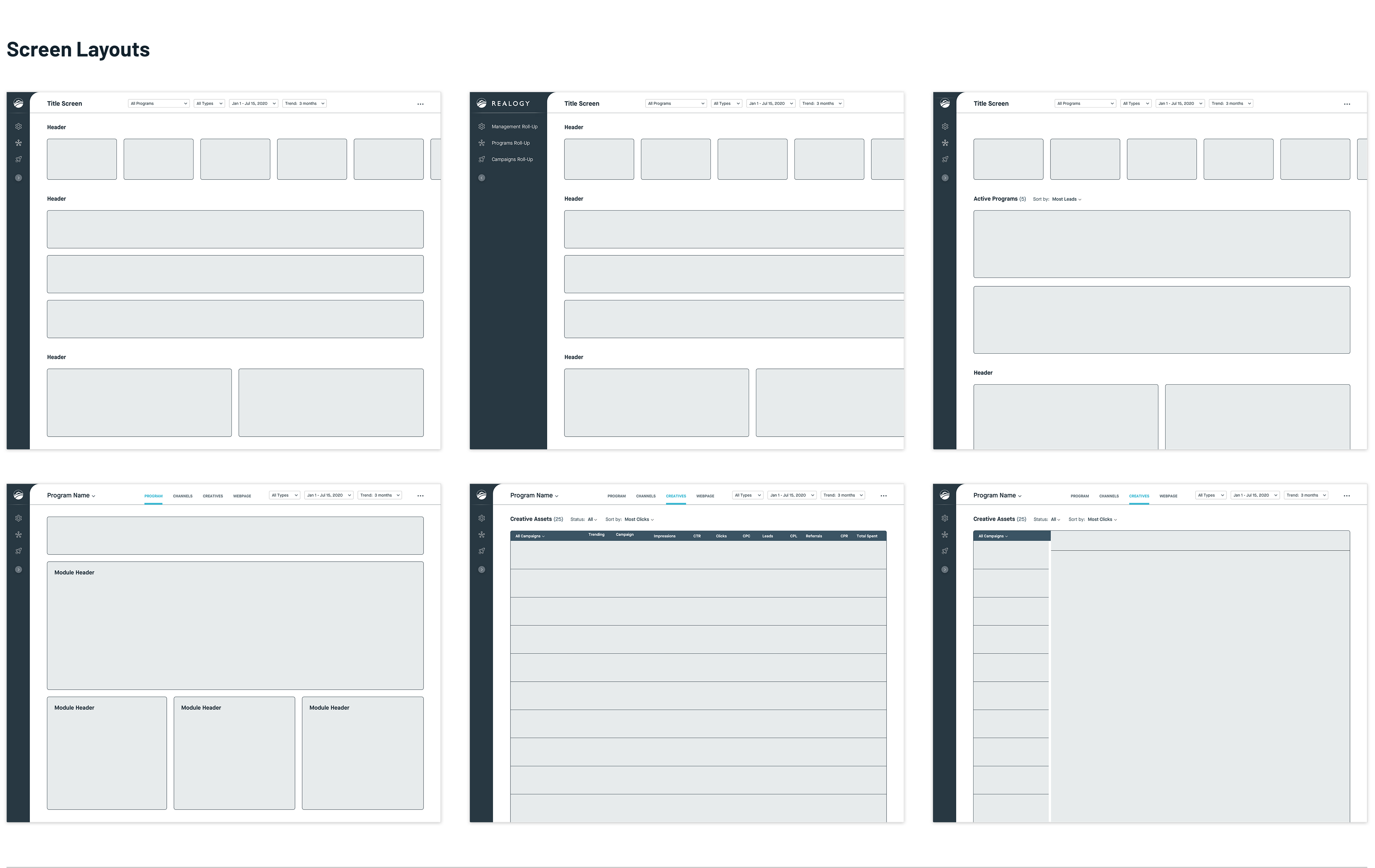
From my previous Realogy Referrals project, I was asked to create a sustainable site architecture for all future Realogy platforms. Though palettes may differ with the associated brands, I have created a consistent font family, look & feel, module system, and scrolling functionality that can be carried across future Realogy digital entities. Below are examples of re-usable layouts and components.


This has been one of my favorite and more challenging projects. I enjoy data-to-design translation, and look forward to doing more. The Realogy team is very delighted with the prototype, and now undergoing Power BI implementation, as well as discussing next steps for post-MVP launch. We will soon be resuming work with Realogy on this project for UAT testing, functional analysis, and expanding scope and features. I will be updating my team's progress!