AON, a leading global insurance brokerage, hired my Mindtree team to re-design their AICPA Member Insurance website for certified public accountants. A re-design was much overdue, as their members complained about the excessive content, and inaccessibility to key workflows in the existing website. Furthermore, they criticized the website for lacking a defined value proposition, intuitive navigation, consistent information architecture, and an engaging user experience. Within 12 weeks, my team addressed the aforementioned concerns, and re-architected an experience that both members and AON stakeholders were excited about.


Creative Pitch I led Mindtree's design pitch to AON, showcasing our design thinking approach, strategy, workshop facilitation, and execution capabilities. I assessed their current site architecture, addressed UX issues, and pitched my vision for a personalized user experience, resulting in the award of a multi-phase contract with AON.
Project Strategy With a Mindtree and AON co-creation model, my collegue David (Mindtree insurance lead & program manager) and I laid out a 12 week consulting agenda, project scope, and deliverables schedule.
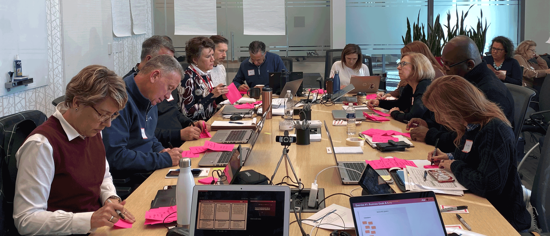
Workshop Facilitation Over the course of 9 workshops, I created design thinking exercises to engage 15 AON stakeholders, identifying their business needs, pain points, and extracting subject matter expertise from them. I facilitated and led design strategy in all workshops.
UX Research Lead I laid out the framework for and oversaw my team's work on user personas, journey maps, and competitive analyses. I conducted a formal Google Analytics assessment, and personally spent over 20 hours interviewing and live-testing with users.
UX Design Lead I restructured the site information architecture, and worked with Mindtree designers Yang and Gino to construct comprehensive wireframes and prototypes, iterating based on testing feedback. Our final output is a validated product engine. The next phase will be focused on "painting the shell" (visual design).
UX Copywriting I led the copy re-writing efforts based on the intended user behaviors I designated for each page. Further re-writing work and approvals from carriers will be needed in Phase 2.
Prior to our contract signing with AON, they requested a timeline for the 12 week engagement. David and I arranged a detailed agenda, which they readily approved. We mostly stayed on schedule, but made minor adjustments based on client needs, and ensured a timely and successful project delivery.


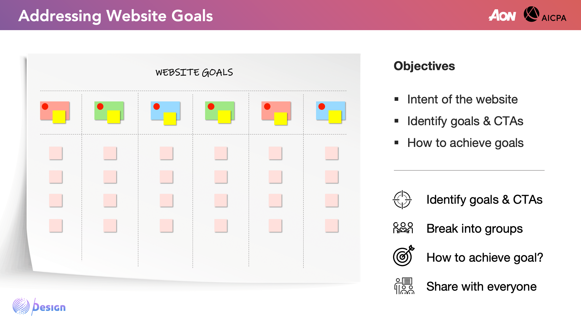
In the workshops, we facilitated stakeholder conversations and encouraged collective participation in the exercises. The intent was to challenge assumptions, identify obstacles, and discover new opportunities.


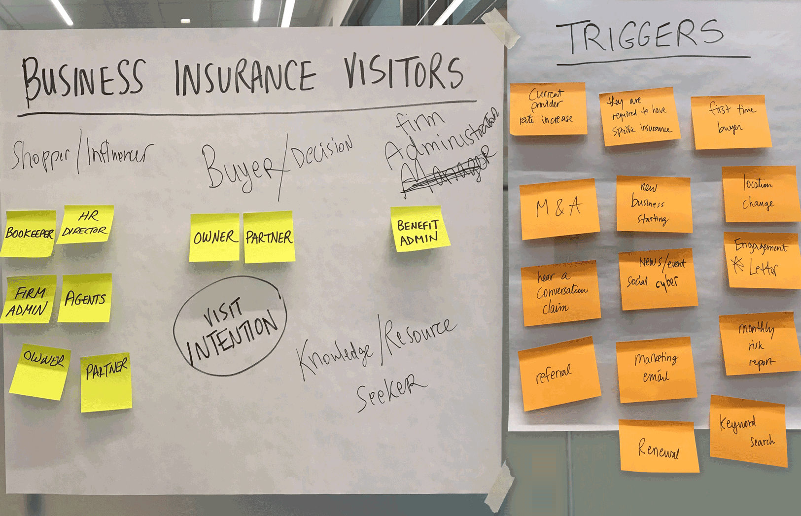

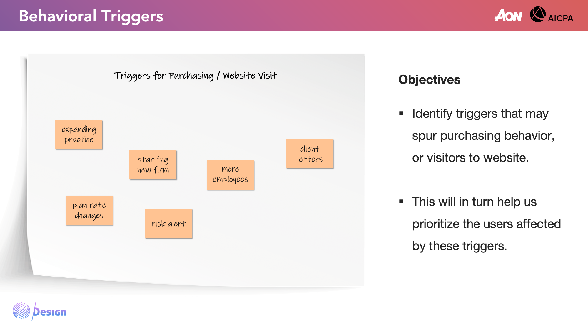
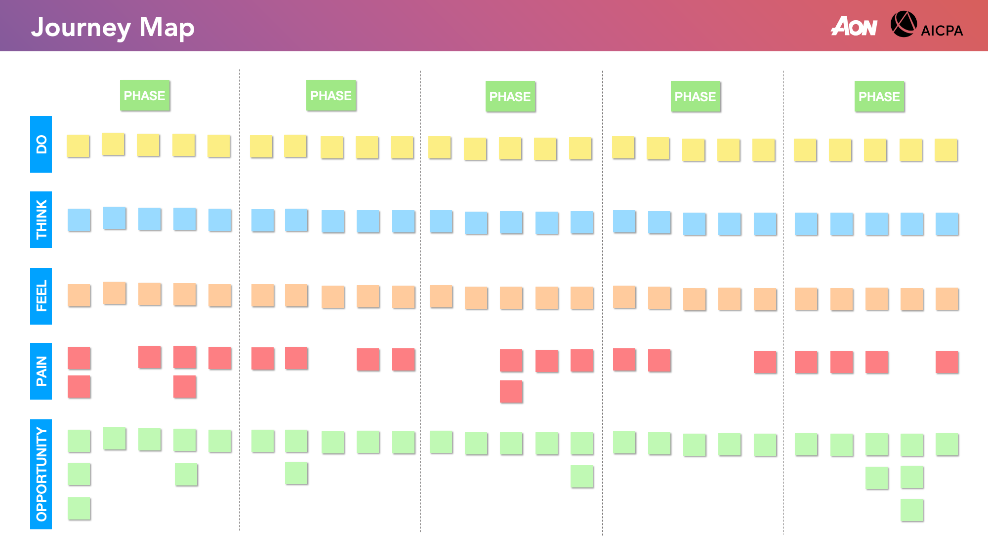
This was one of the most valuable outputs from the workshops, and is transcribed below from sticky notes. It encapsulated the other exercises to identify user types, actions, goals, motivations, and triggers. This will be examined again later, and will be more specified after acquiring additional user information.

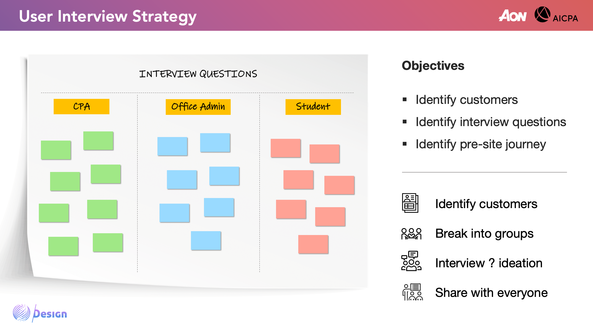
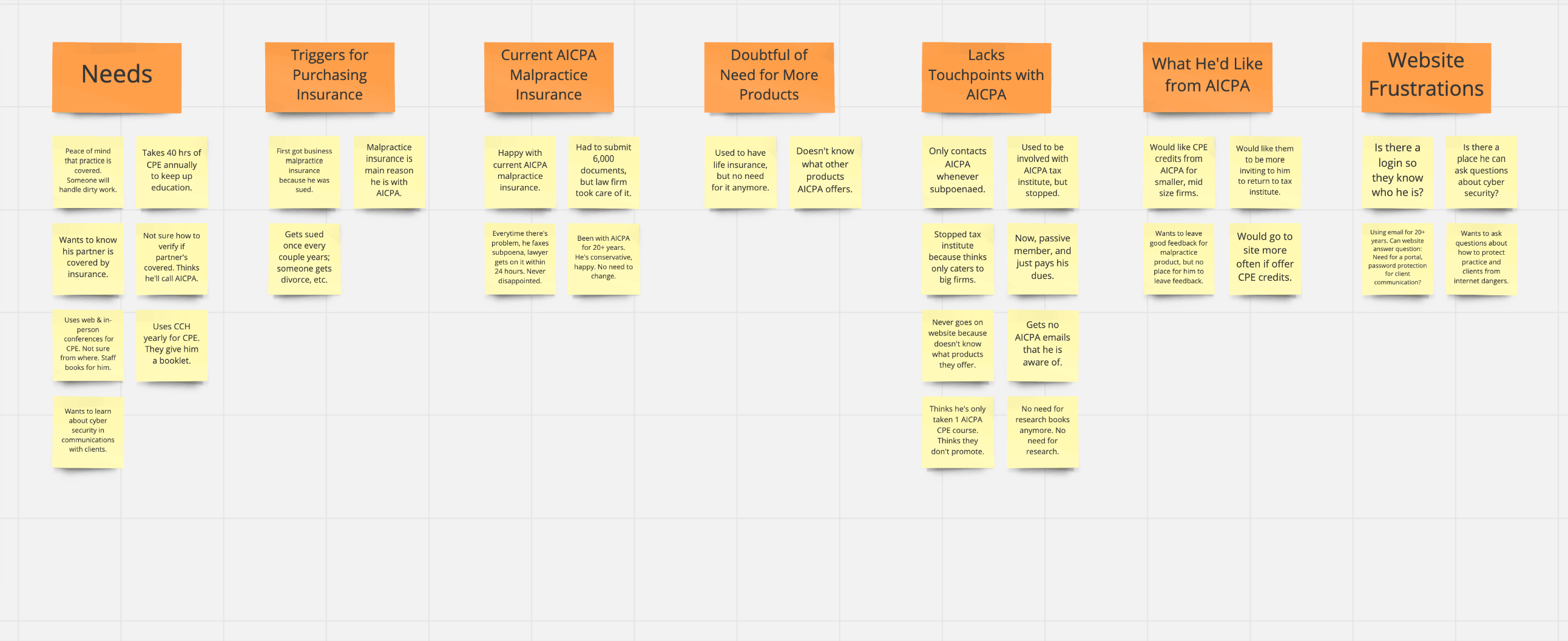
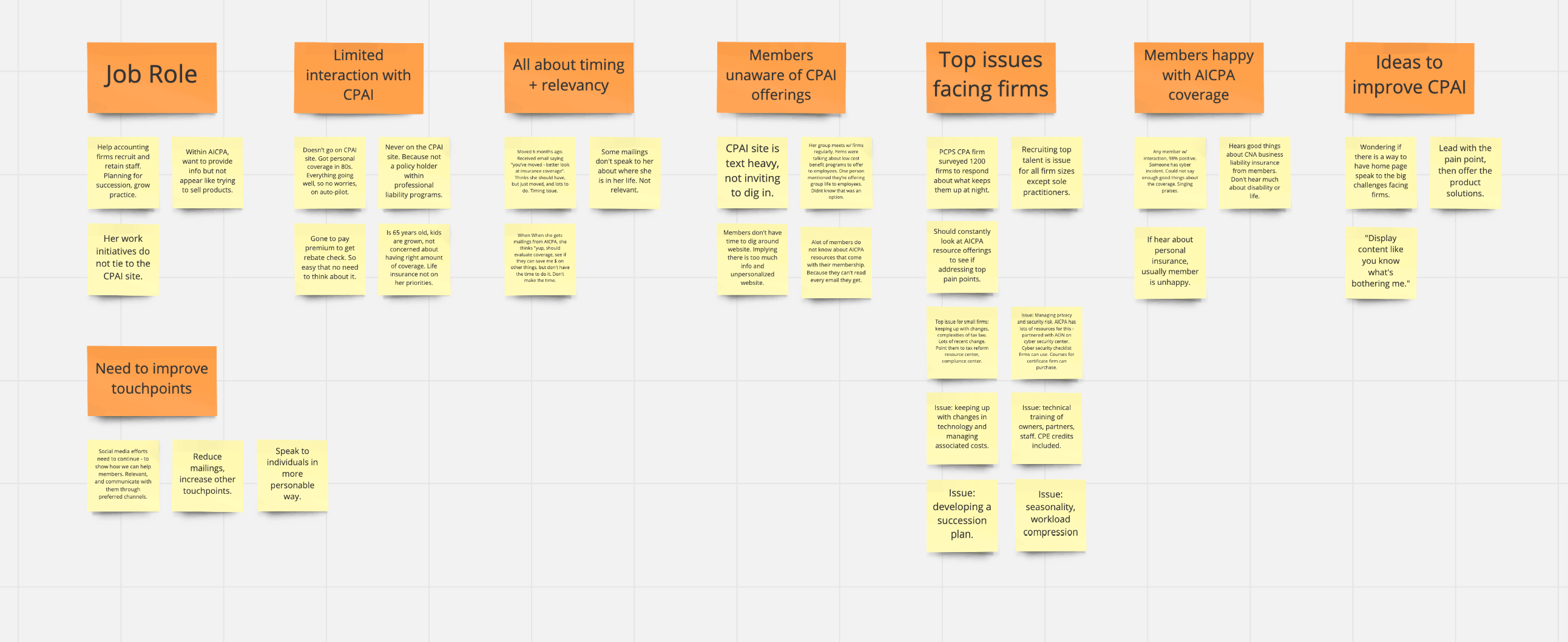
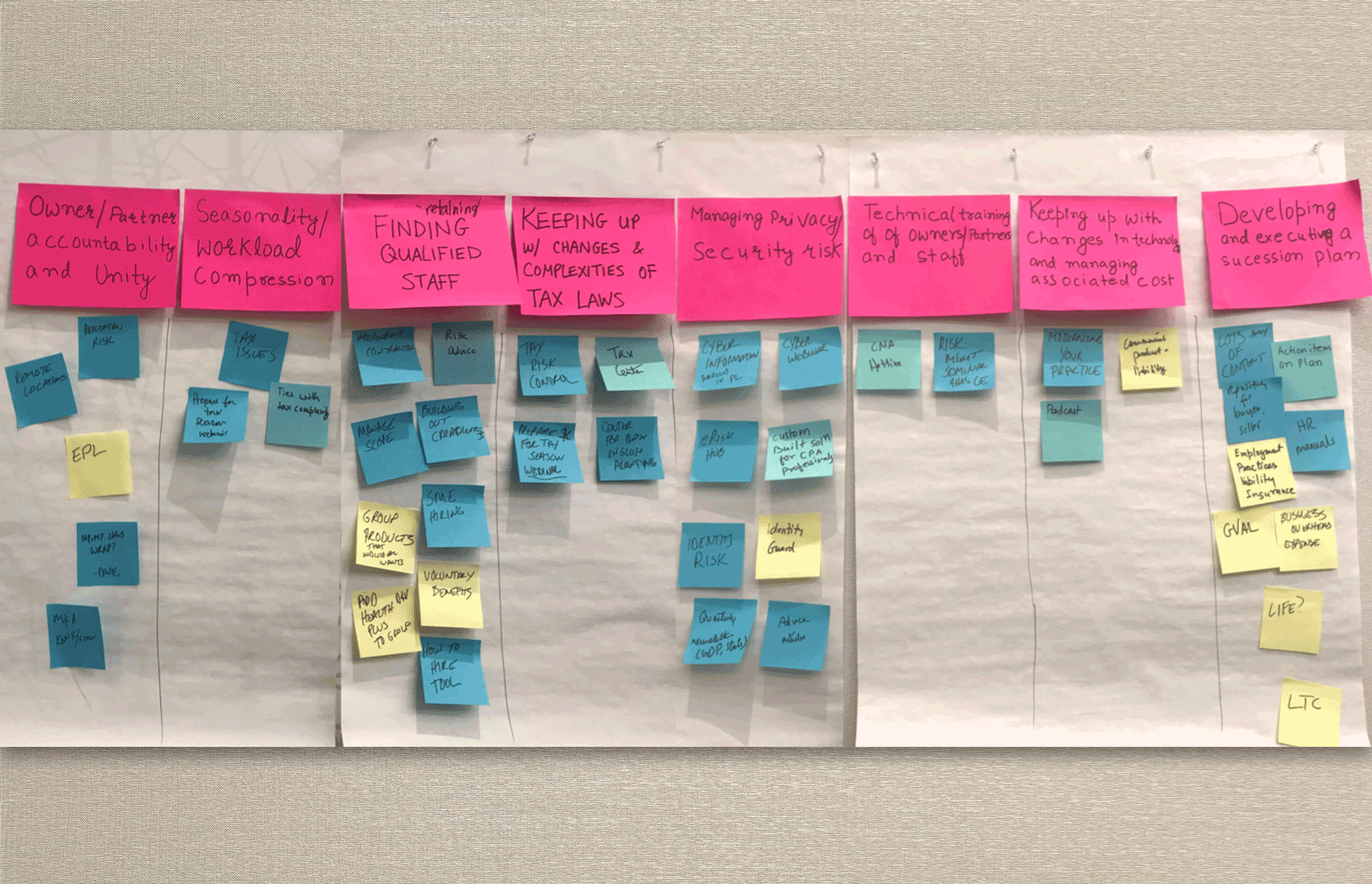
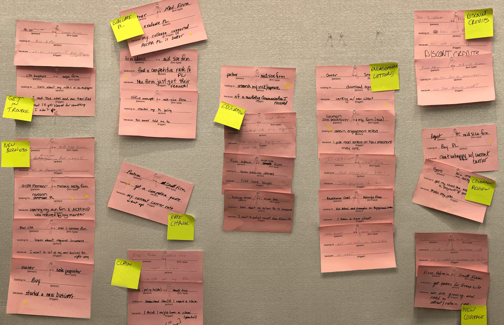
In addition to understanding AON's business goals and their perception on the insurance market, it was important to hear their clients' feedback. My intention was to identify overlaps between client and user needs, in order to prioritize website features and functions. I came up with research strategies to conduct on CPAs, creating and receiving validation on interview questions (shown below) from the AON team. I then conducted and recorded 10 hours worth of in-depth interviews with AICPA member CPAs and non-members.

AON had provided 10 members (as shown below), each with varied backgrounds and policy ownership, for David and me to interview. We then synthesized all 10 interviews, replaying the interview recordings to extract feedback insights and sorting recurring themes into affinity maps and key insights.


Content Relevance On the existing site, users complained about the excess of irrelevant products and information shown. Feedback included recommending policies and resources based on age, family status, and firm size. This prompted our team to include a "CPAs like you also purchase..." suggestion.
Admin Control Users expected a login feature, where they can see and manage all policies owned. They would like to be able to pay for and renew policies online - not just receive bills via post. Our team agreed that having this login would enhance product cross-sell opportunities.
Content Clarity & Accessibility Users wanted easier access to insurance plan features, FAQs, cost, coverage details, and intuitive navigation to key links, without showing all content upfront. They were also hesitant to click on a resource unless they knew whether it's presented as a video, article, calculator, etc.
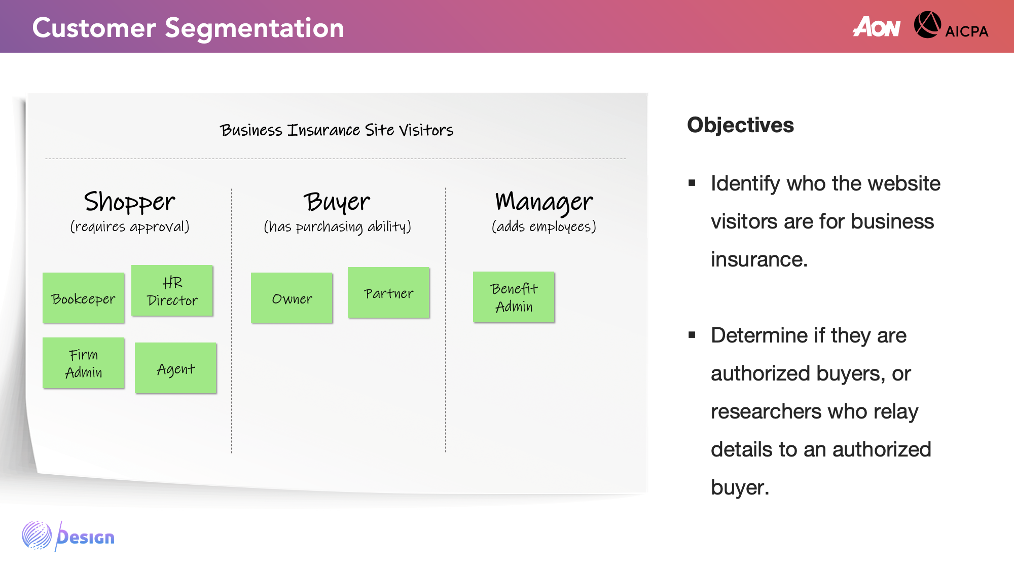
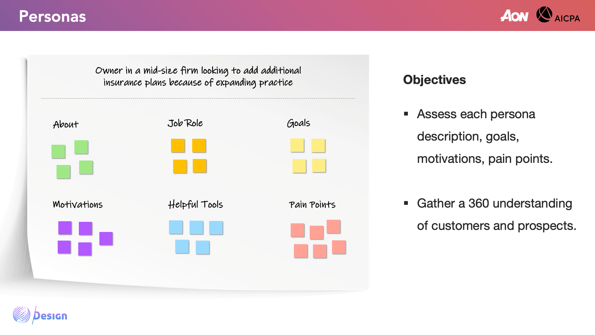
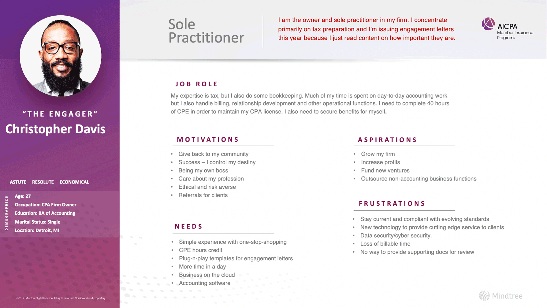
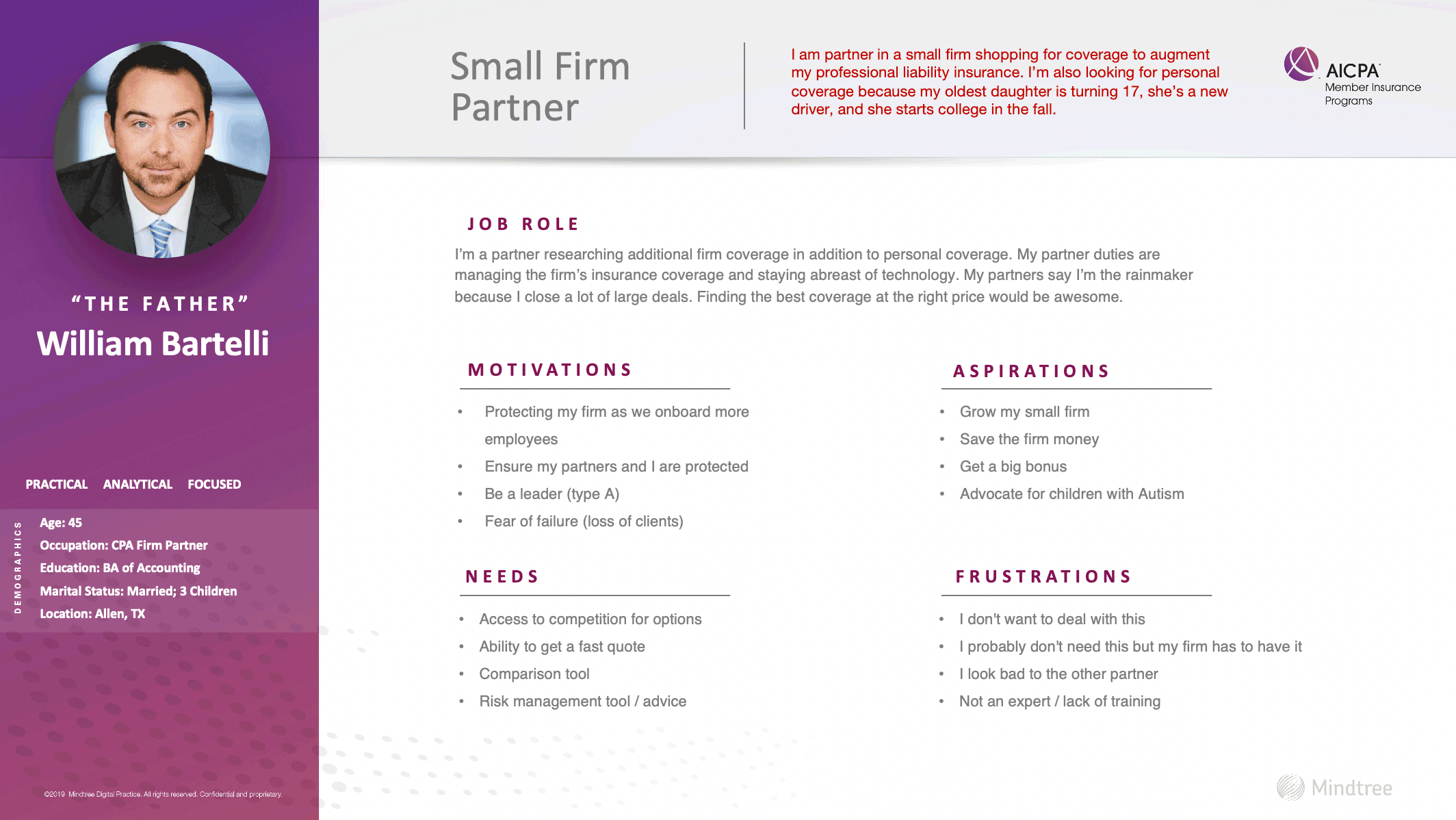
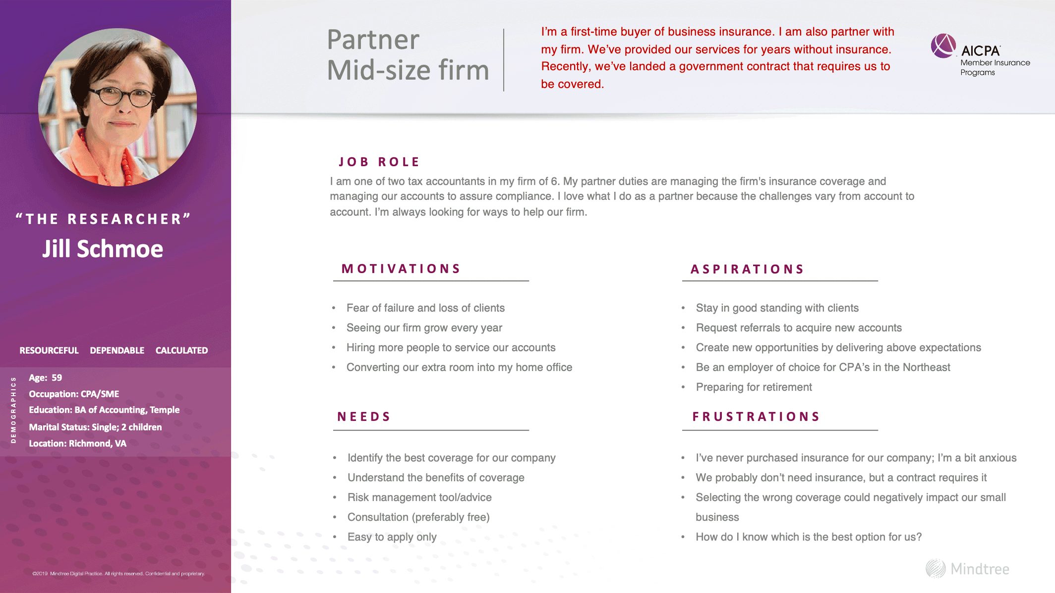
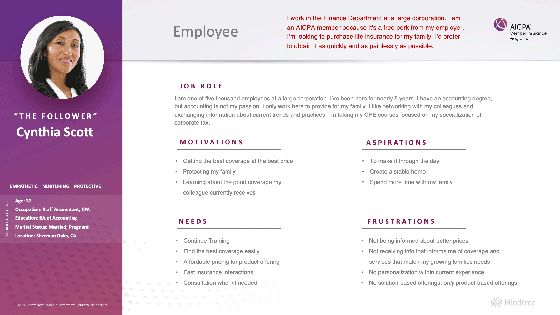
Based on these user interview insights and previous persona and customer segmentation workshop exercises, we were able to identify 4 primary behavioral archetype personas, and their respective journeys and workflows throughout the website. I directed this process and worked with the AON team to flesh out these personas and journeys, while Gino (Mindtree designer) applied the graphics, as shown below.


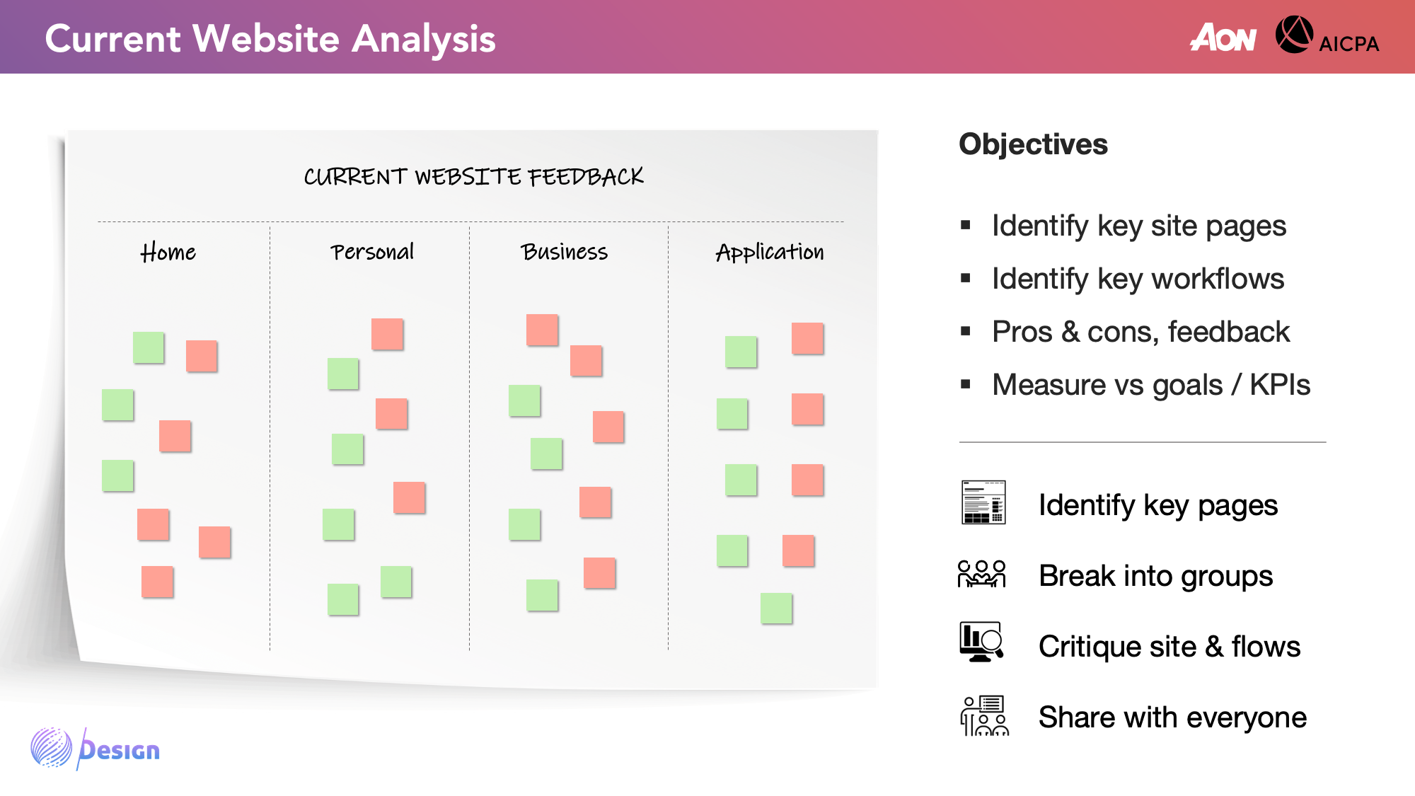
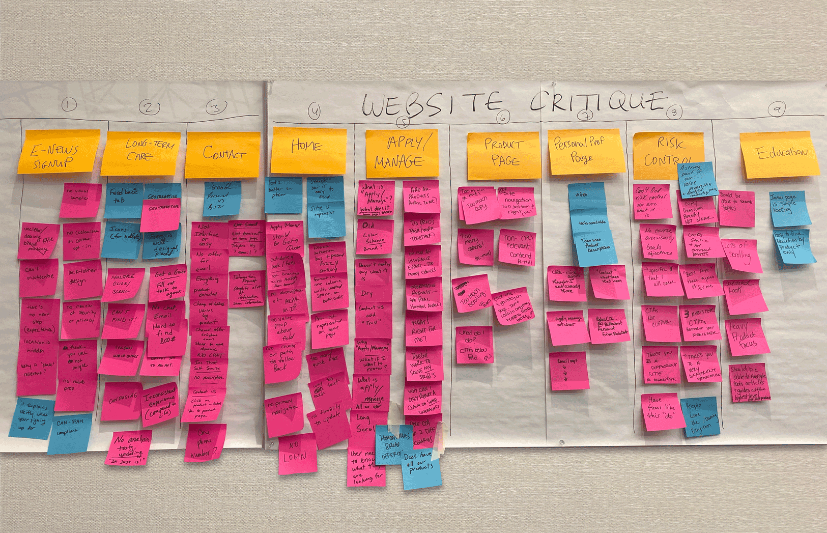
After extracting insights from both client and user perspectives, we had the proper criteria for assessing AICPA's existing site performance. I mapped the existing site's key pages to gauge content requirements, evaluated UX heuristics, and assessed web metrics on Google Analytics.

Low Retention 60% of first-time visitors do not return to the site within first year.
Low Engagement Many visitors land on a cache logged-in account page (which is separate from rest of site), and also exit from that very page, without seeing marketing, product or updated content and information.
Weak Referral Traffic AICPA site has strong SEO and direct traffic due to their brand authority, but is mediocre in referral and social traffic.
Unmet Expectation Users are looking for a "login" function on the site, but are unaware if it exists, hence they query "login" on the in-site seach, making it the #1 searched term.
I evaluated the current AICPA website against requirements from both AON and client members. My heuristics criteria includes content accessibility and clarity, intuitive placement of CTAs, ease of navigation, and focused intent toward specific user actions.


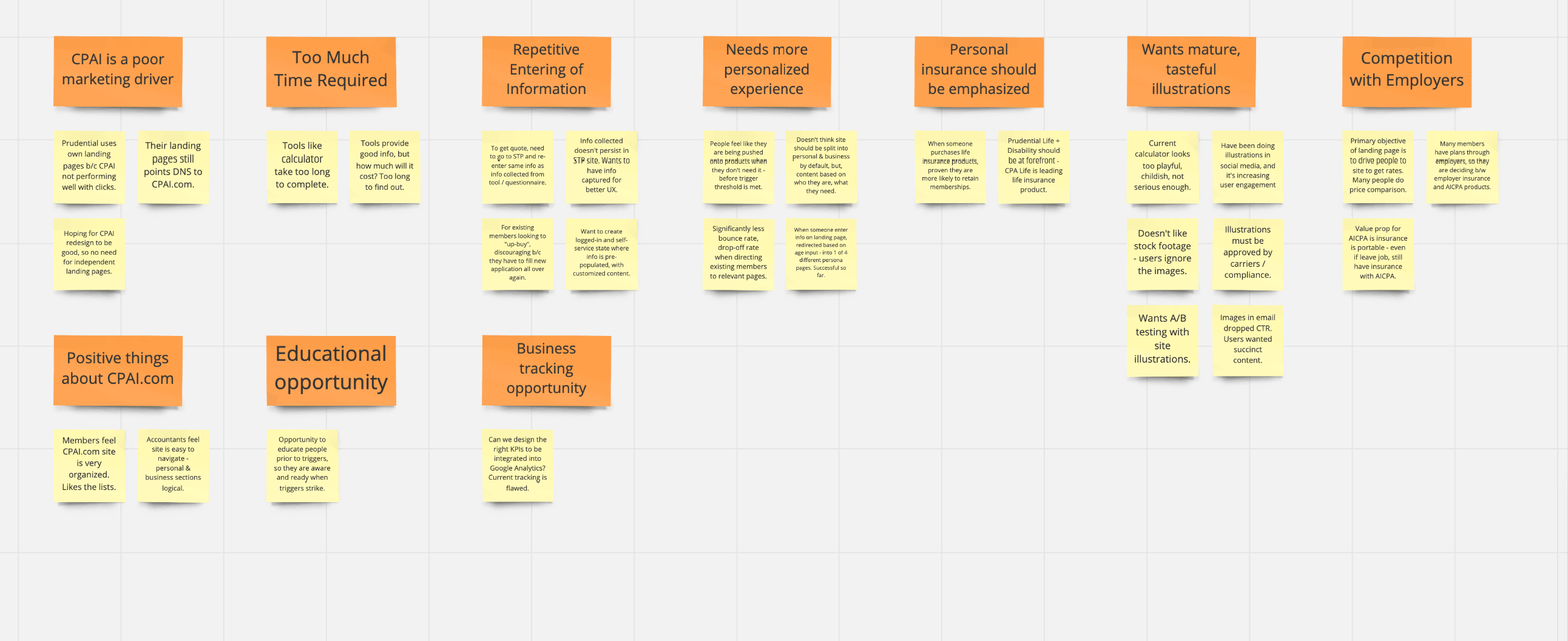
While we were able to obtain an in-depth understanding of our users' personas, journeys, and pain points, it was insufficient to base our ideation solely on these criteria. I felt investigating best website practices from competitors and parallel industries would help spur creative ideas. In addition, we could "borrow" or improve upon their successful features and functionality.
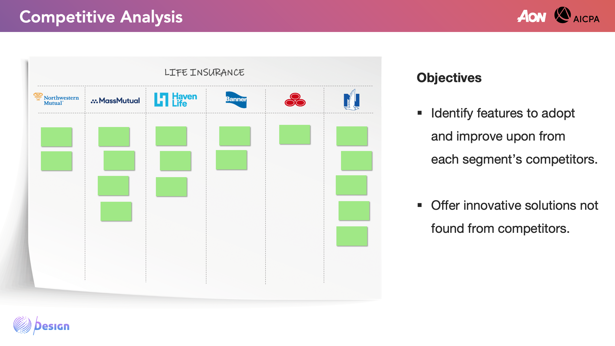
We investigated 2 types of competitors: (1) services-based, such as other regional, national, or global insurance brokerages (2) products-based, such as major carriers for life insurance or professional liability. We held a workshop exercise where our AON clients identified these competitors' strengths and weaknesses, as shown below.

From this matrix are some notable competitor features that we referenced:
Hiscox | Consistent Structure On Hiscox's site, their insurance product pages follow a logical order with headers Why professionals choose Hiscox, What is covered, How much it costs, and Reviews. We believe this direct information flow would work well for the AICPA site.
Haven Life | CTA Focus On Haven Life's site, their homepage has only 1 call-to-action and limited text. This helps navigate users through the intended narrative and workflow. Furthermore, their successful use of anchor links reinforce the very same feature we had also planned to implement.
MetLife | Choose Your Adventure On MetLife's homepage, What would you like to do today? appears, with 6 options - each of which directs toward different experiences. We believe this intent driven approach would create more customized experiences.
Progressive | Topics On Progressive's site, they provide recommendations and answers to common insurance questions. AON's AICPA site already has an education section, but Progressive inspired us to add a Common CPA Concerns feature.
In addition to researching direct competitors, we also looked at best practices from cross industries. Shown below are examples of features we referenced from other companies.

Stitch Fix | Customer Segmentation On StitchFix's site, they call out persona experience tracks. We incorporated a similar feature to recommend insurance plans for small, mid and large size firms.
Stripe | Renowned Authority On Stripe's homepage, they boldly declare themselves as "the new standard", showcasing their premier clients. We believe this approach would enhance AICPA's branding and communication to CPAs.
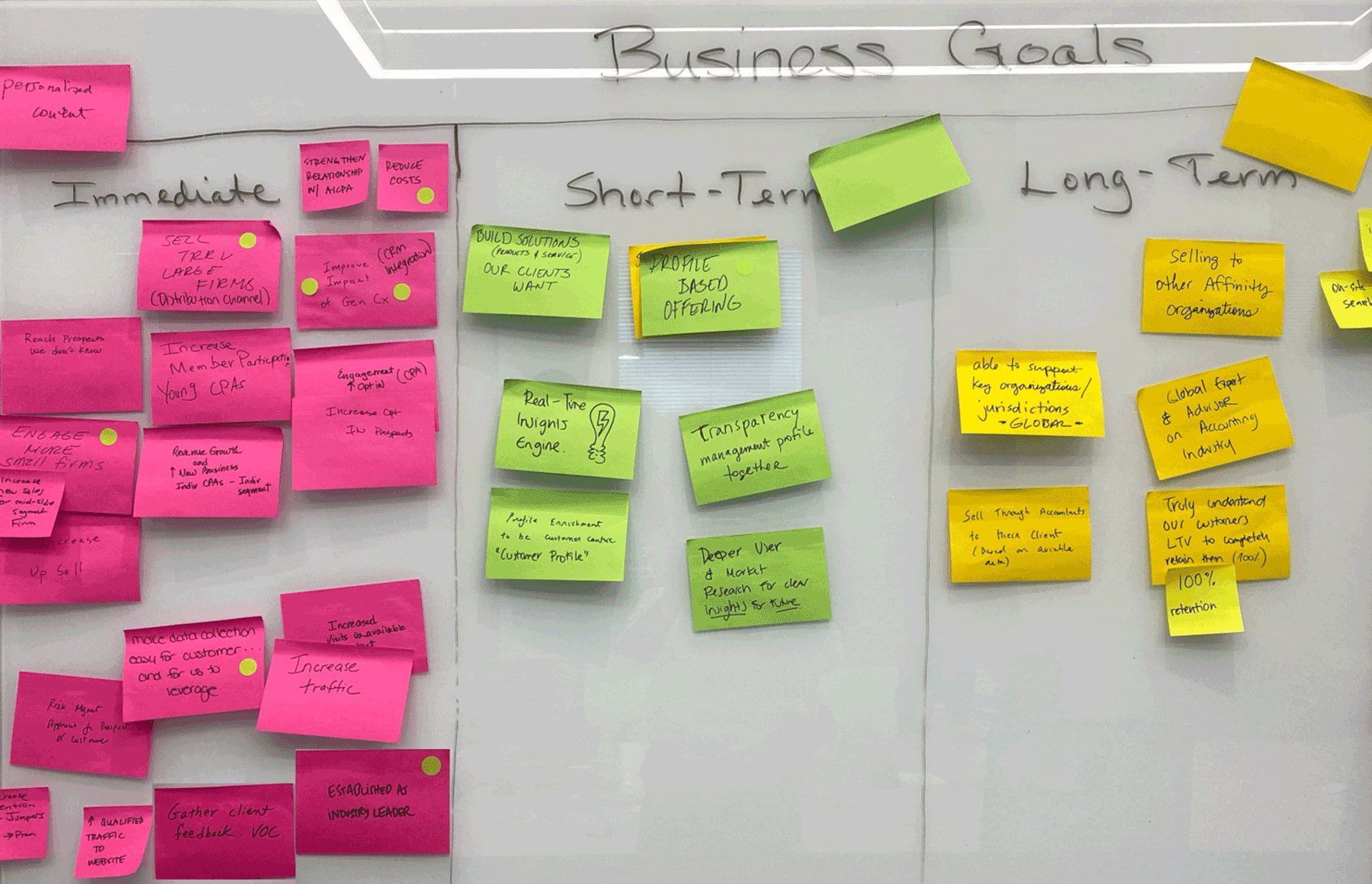
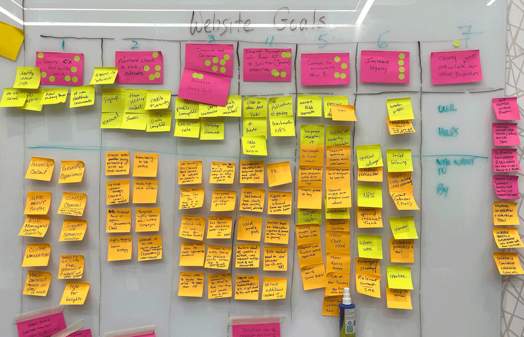
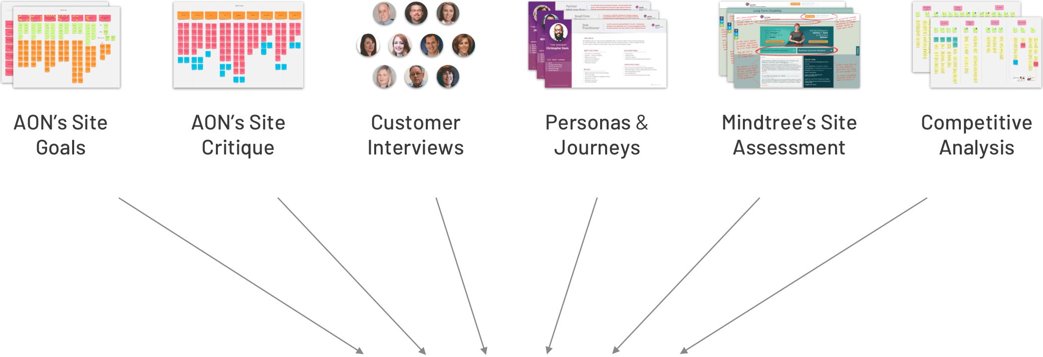
As described in the previous sections, my team took many research criteria into consideration, such as AON goals, existing site assessments, personas & journeys, customer interviews, and competitive analysis while compiling a requirements documentation. We then worked with the AON team to identify requirements priorities to focus on during ideation for both the immediate roll-out and long-term roadmap.
Based on our prioritization discussions, David compiled a requirements list, categorizing every feature/function type, such as lead conversion, customer experience value, solution provider, risk education, and new business acceleration. These features were ranked based on importance and level of execution effort, and tagged to either design or technical owners accountable for implementation.

Uniform Product Pages Ensure all insurance products pages follow a consistent format.
Login / Manage Policies Enable users to easily login, view and manage their policies.
Personalize Content Leverage Salesforce data and segmentation frameworks to provide product recommendations and relevant content.
Unify Disjointed Experiences Link STP platform for dynamic content personalization.
Up-sell / Cross-sell Products Increase complementary insurance policy promotions via product pages, education articles, Common CPA Concerns, and logged-in settings.
Enhance Brand Message Articulate unique selling points, customer value, and narrative.
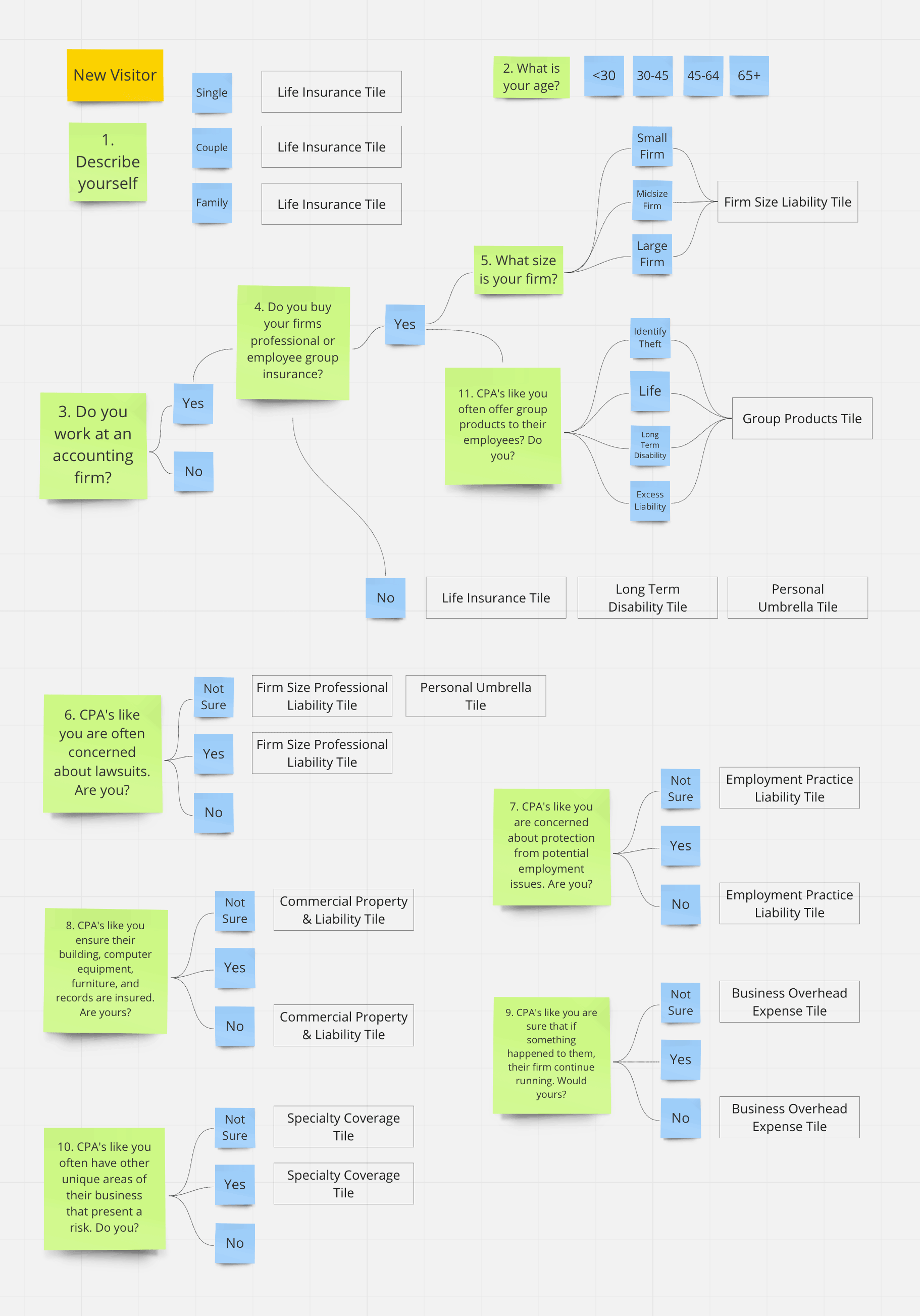
Our first priority in re-architecting the AICPA website was defining the personalization model. David and I referenced various criteria, as shown below, to determine the appropriate content that would be served to customers. Although this criteria appears in questionnaire format, this workflow is only meant for internal team analysis and testing. We intend to seamlessly interject engaging prompts and visuals for non-logged-in customers to interact with, and provide us the necessary data for personalization.
After synthesizing all our research and defining prioritized requirements, we involved the AON team for design ideas, since they were most familiar with the website and have been discussing potential solutions for a while. It also allowed them to have their voices heard, and be invested in the design process. As part of the divergence phase, we sought to capture a range of ideas from the AON team; we held timed 10 minute sessions per page for everyone to sketch. We then had playbacks with group critique, and identified consensual design inputs.


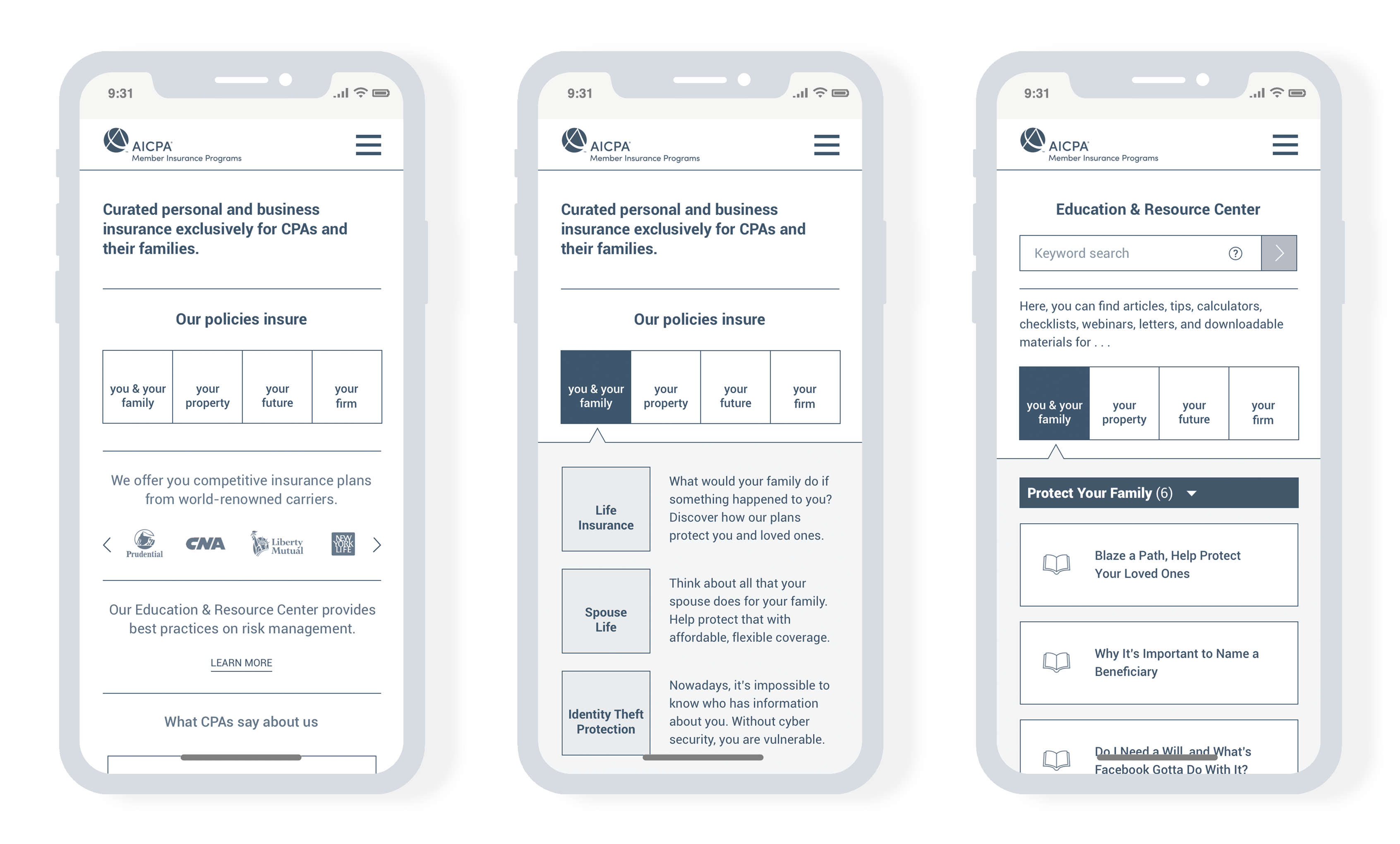
Following the ideation sessions, Yang (Mindtree designer) and I cohesively aggregated the AON team's sketches and inputs with our own designs into wireframes. Once we created a basic prototype with key pages, we conducted live usability testing with AICPA members and non-members. Within one month, we gathered 14 hours worth of feedback. Our continuous testing process enabled us to validate, refine, and pivot quickly. Shown below is our initial set of low-fidelity wireframes and user feedback.


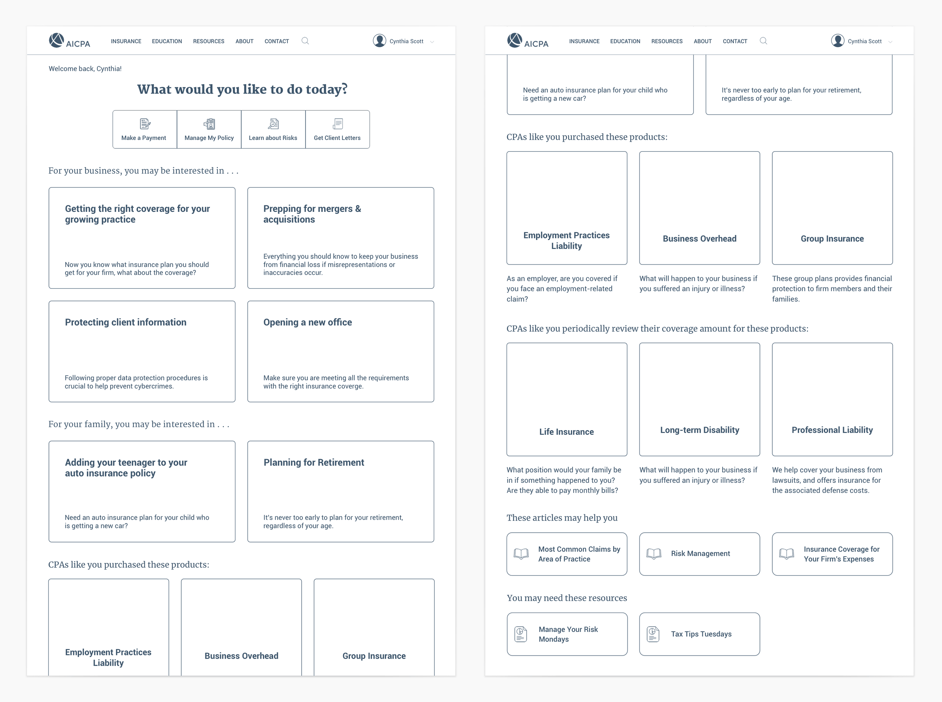

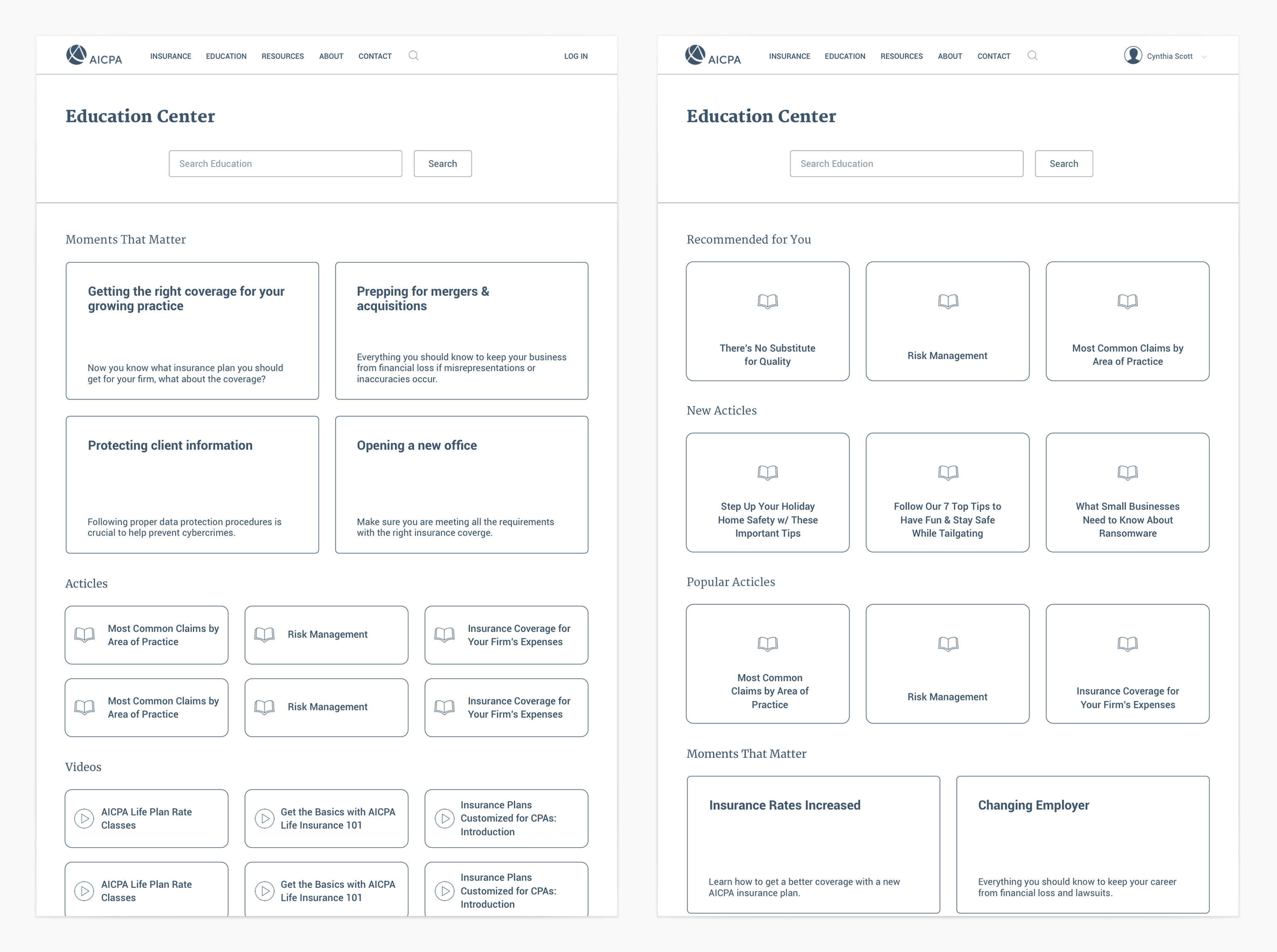

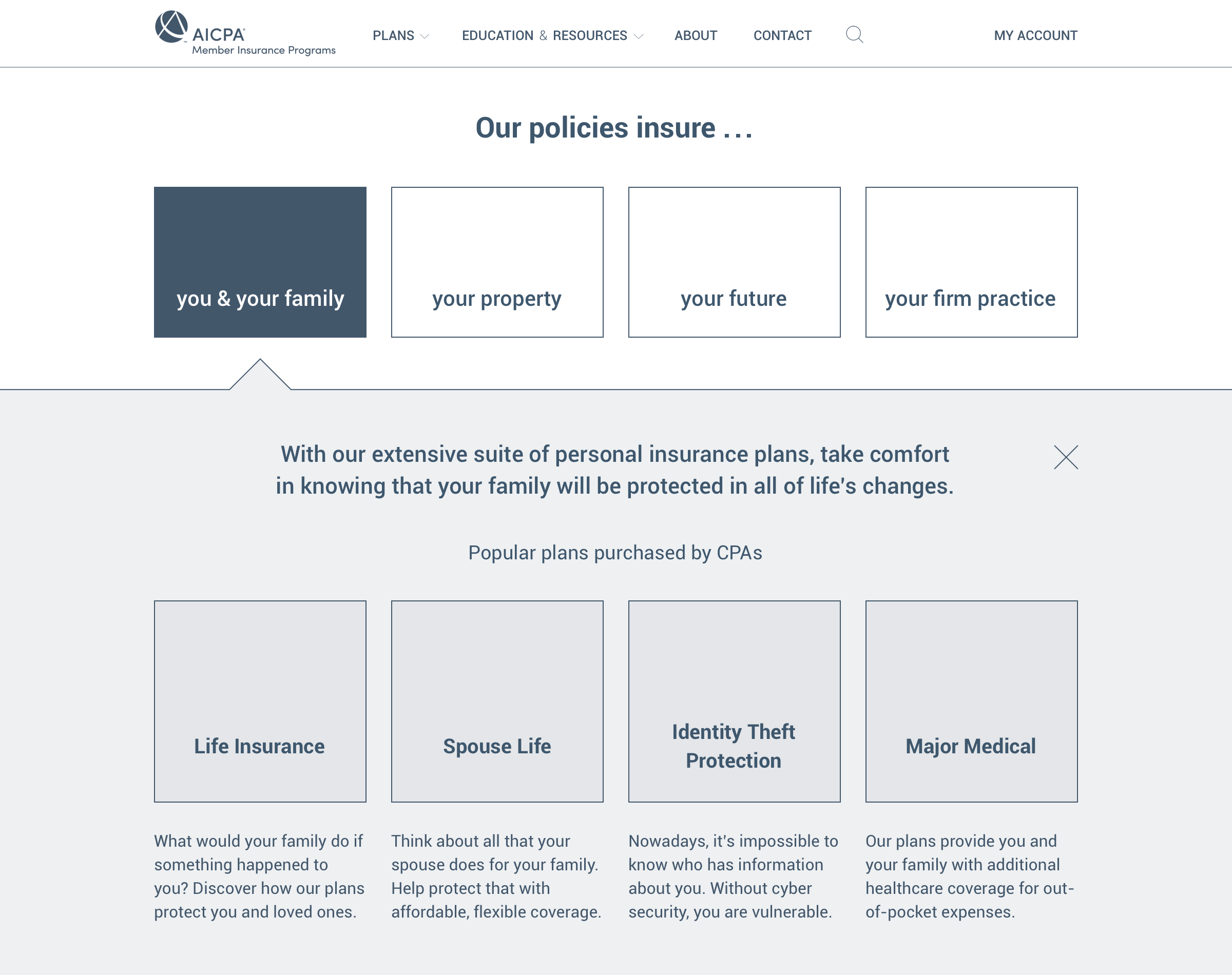
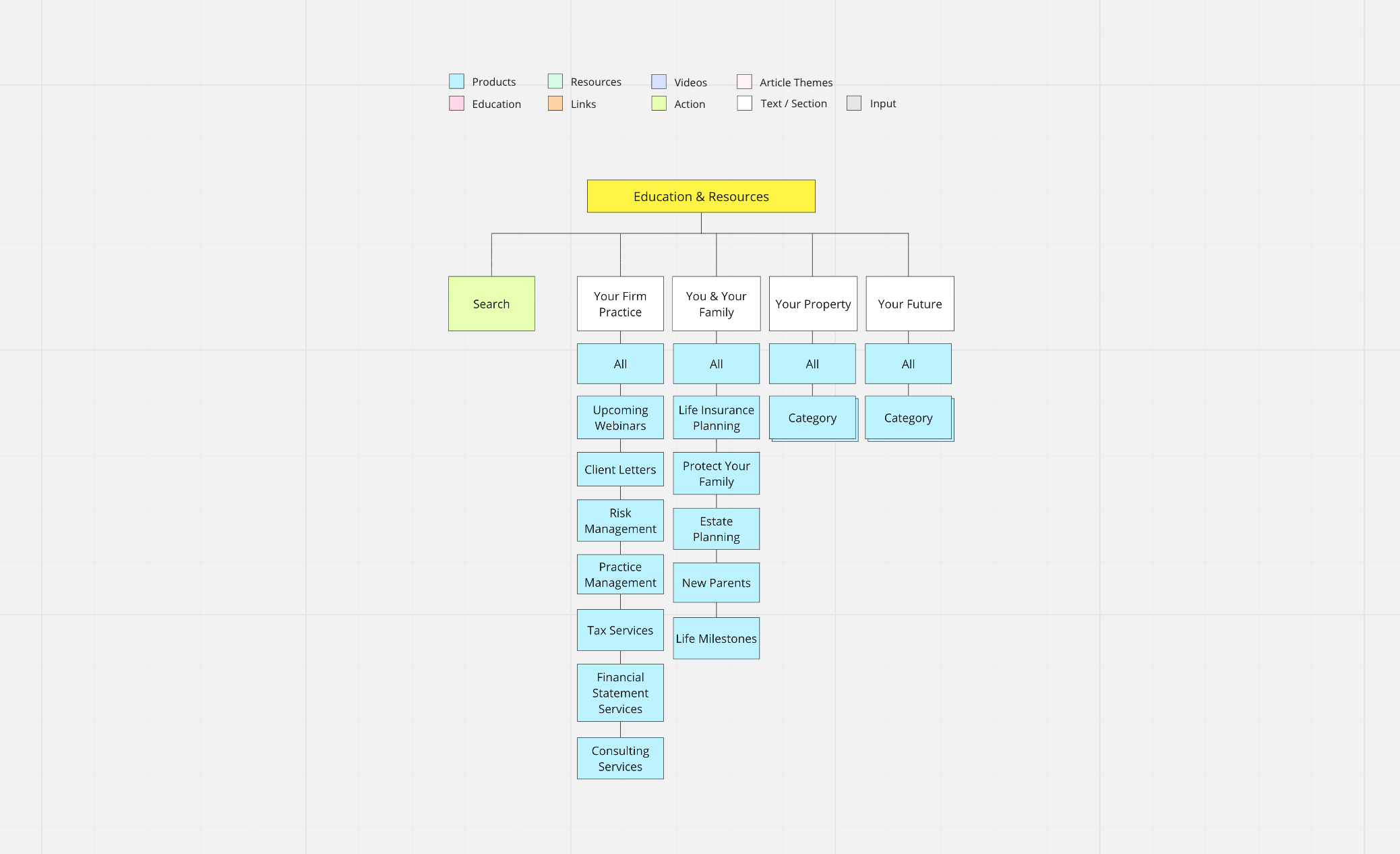
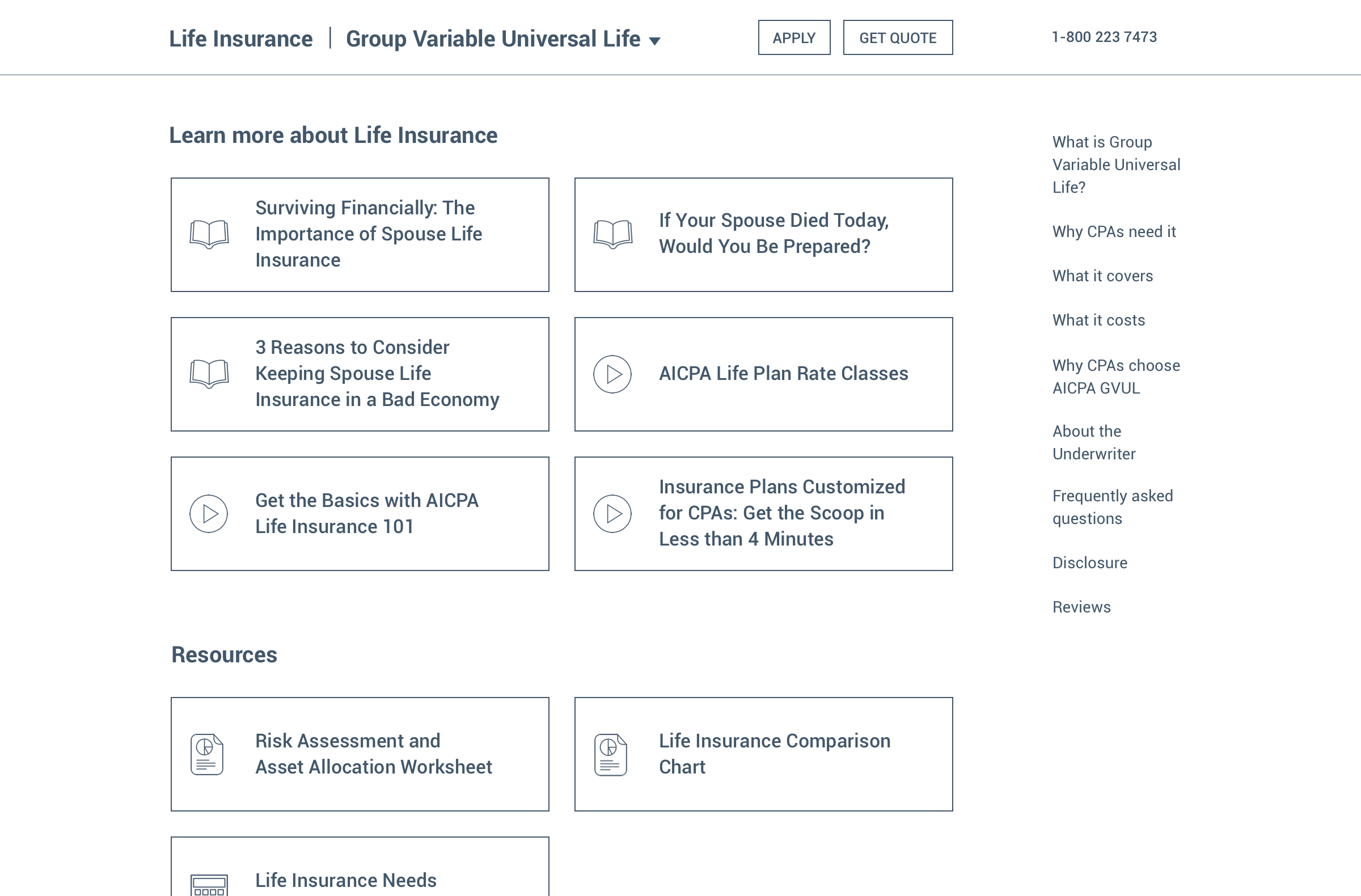
As our team continued iterating on designs based on member and AON feedback, we also modified our proposed and refined information architecture, as shown below. I initially defined the structure and content of all pages, while Yang made updates to reflect the mid-fidelity prototype.


In addition to redesigning the page structure and information architecture, I considered our content strategy and primary intent of each page. Gino and I rewrote the copywriting and adjusted the messaging accordingly. After live user-testing and iterating on our prototype for a month, we arrived at mid-fidelity wireframes (as shown below), which users were very pleased and in accordance with.


* Illustration by Yang Cong


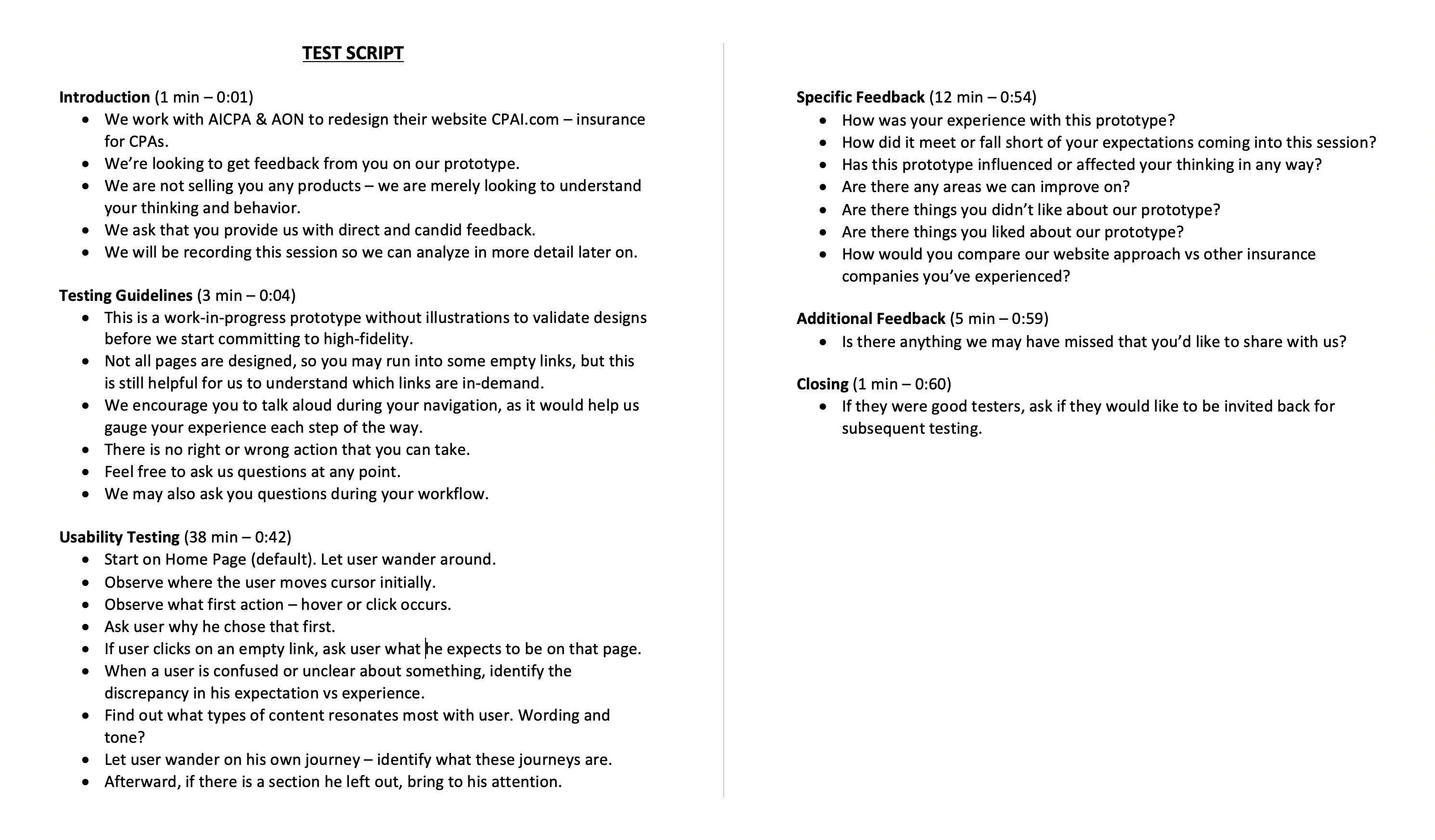
My testing strategy was based on live video screen share sessions, where I was able to follow users' cursors to get a first-hand view of their experiences. I encouraged them to think and talk out loud, without me giving any input, thereby simulating an authentic session. Occasionally, I may have asked why users chose to click on links or scroll past content. I prompted them to explore the site freely, without set workflows - to remove the notion that I was expecting them to fulfill certain tasks. Most importantly, I told them not to click on every link for the sake of testing, but rather to interact with the prototype as they naturally would be inclined to do. After concluding their sessions, they provided overall feedback, answering all the questions shown below.

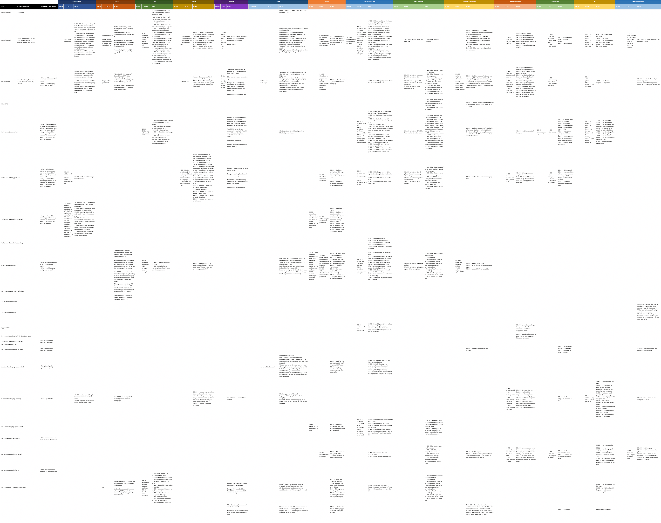
Following the live testing sessions, I wanted to document frequent user tendencies and actions. Thus, I designed a usability test matrix (shown below) for each screen on the prototype. Yang helped track users' actions, which enabled us to refine and finalize design decisions. The Y-axis represents CTAs and content for every screen, and the X-axis shows all 14 users (each shown in a different color). The results indicate a fairly even distribution of users' achieved CTAs and viewed content across all pages, which signified that nothing on our prototype was deemed unnecessary or out-of-demand.
In addition to the CTA analysis, we wanted to capture user soundbytes; I selected footage excerpts from 14 hours of recorded sessions, and compiled a reel of our users talking, walking-through, and interacting with various site pages on our prototype. This footage also reflects the evolution of our prototype. The AON team appreciated this video for reference and concept validation prior to the high-fidelity design and development phase.
At the end of this first phase, my team had fulfilled our contracted scope of work, accomplished a validated proof of concept, a low-fidelity prototype, and established a strategic direction for AON's business goals to be met through the AICPA site re-design. We presented our deliverables to the entire AON team, to their delight and satisfaction, achieving project objectives as shown below:

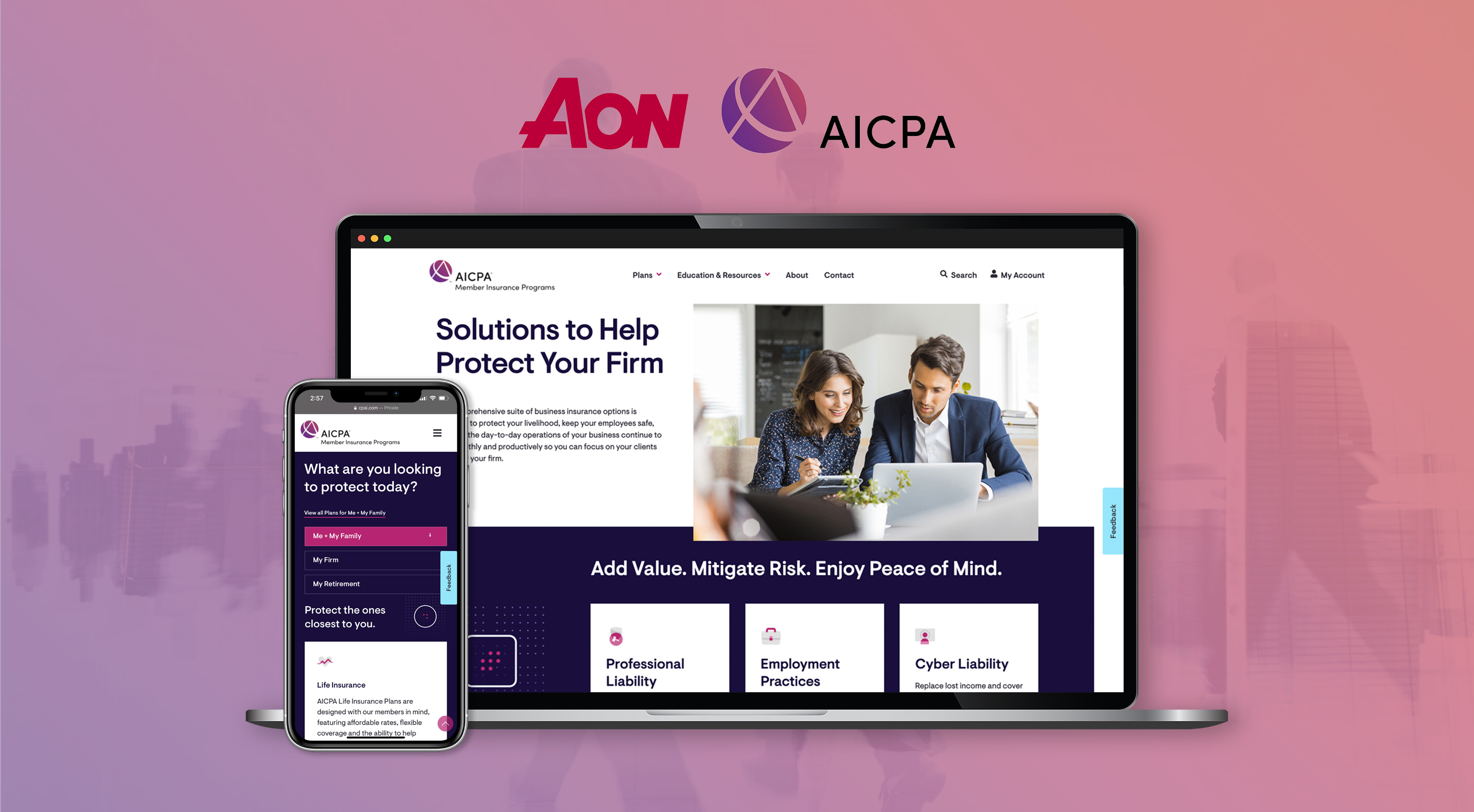
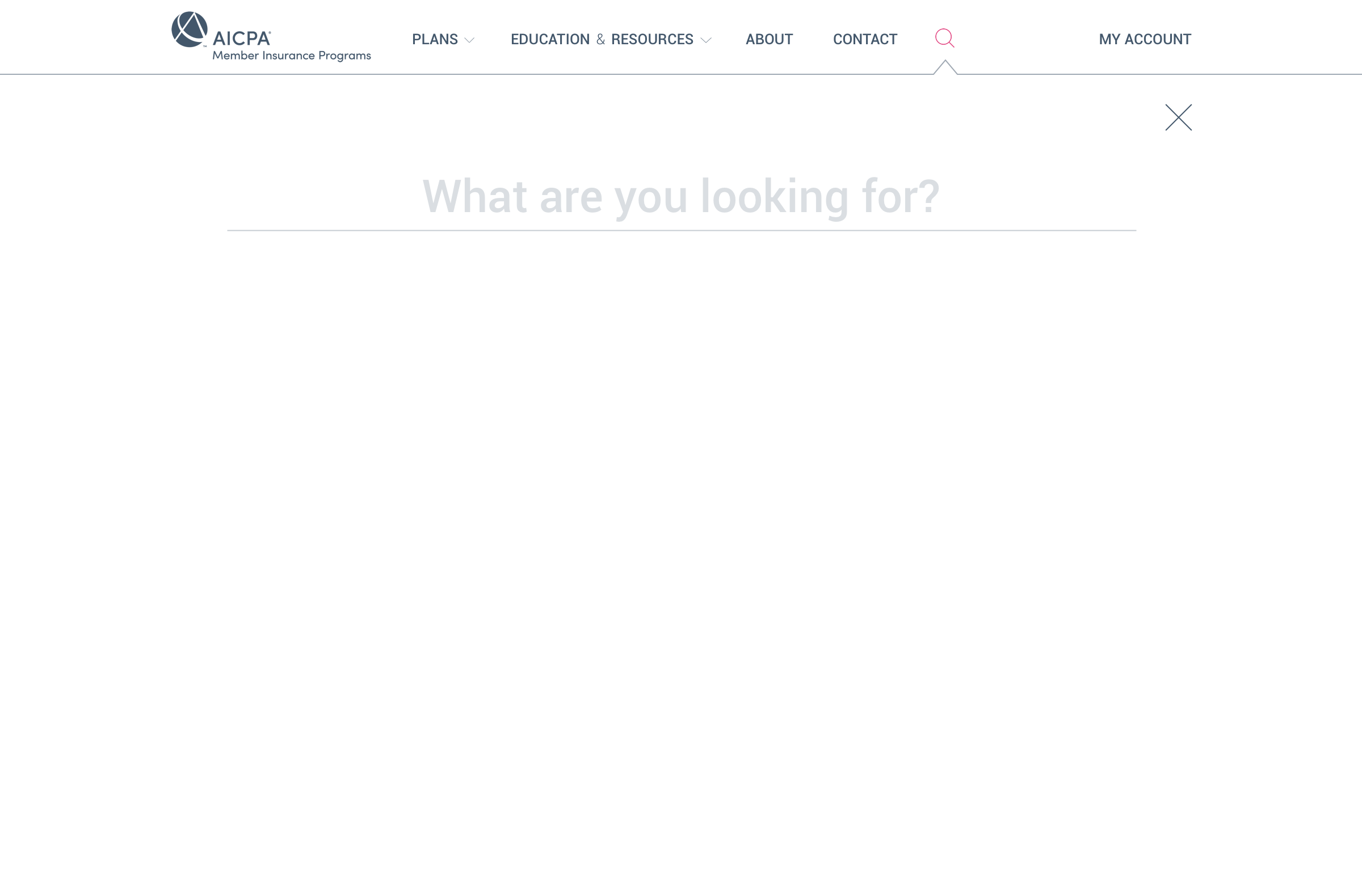
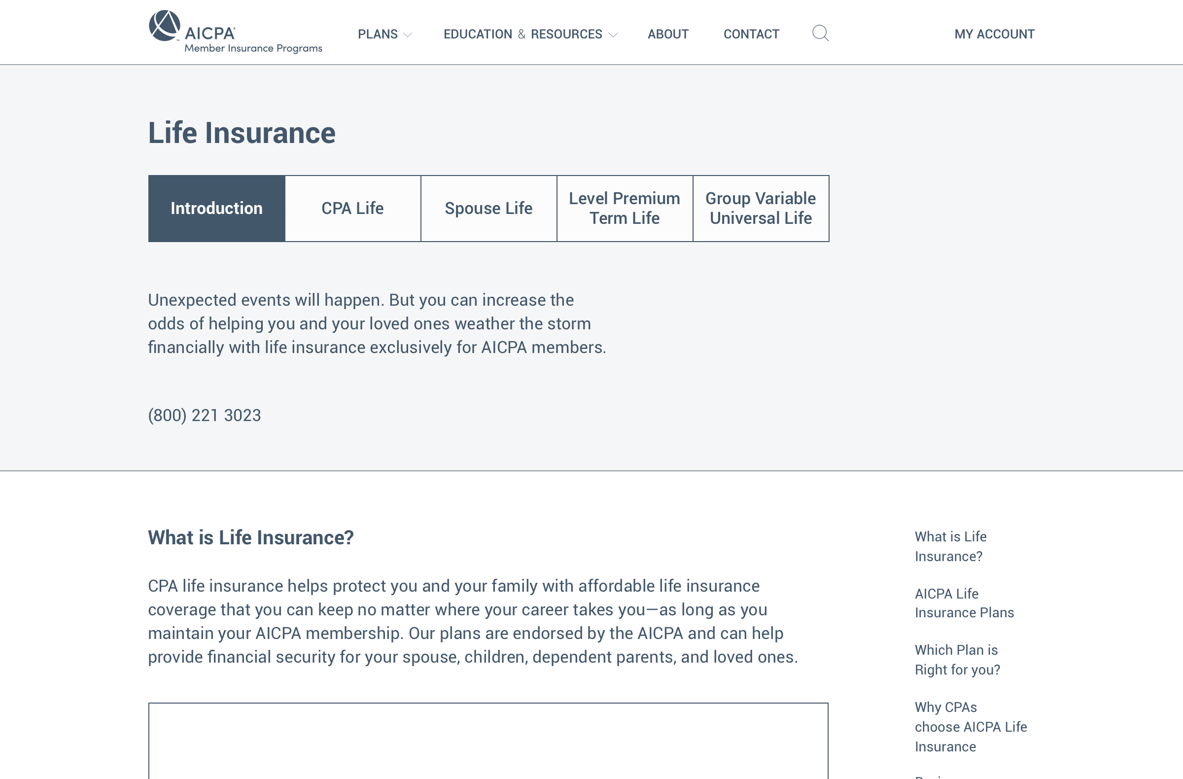
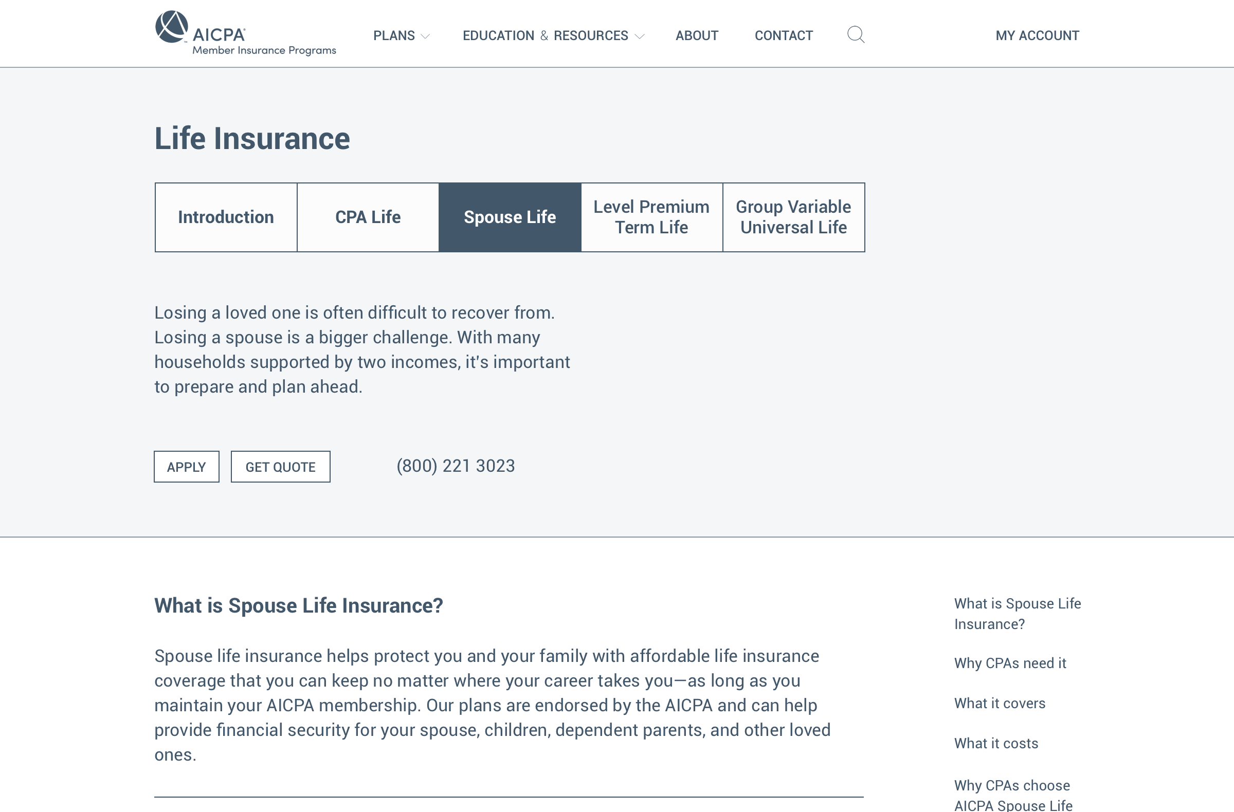
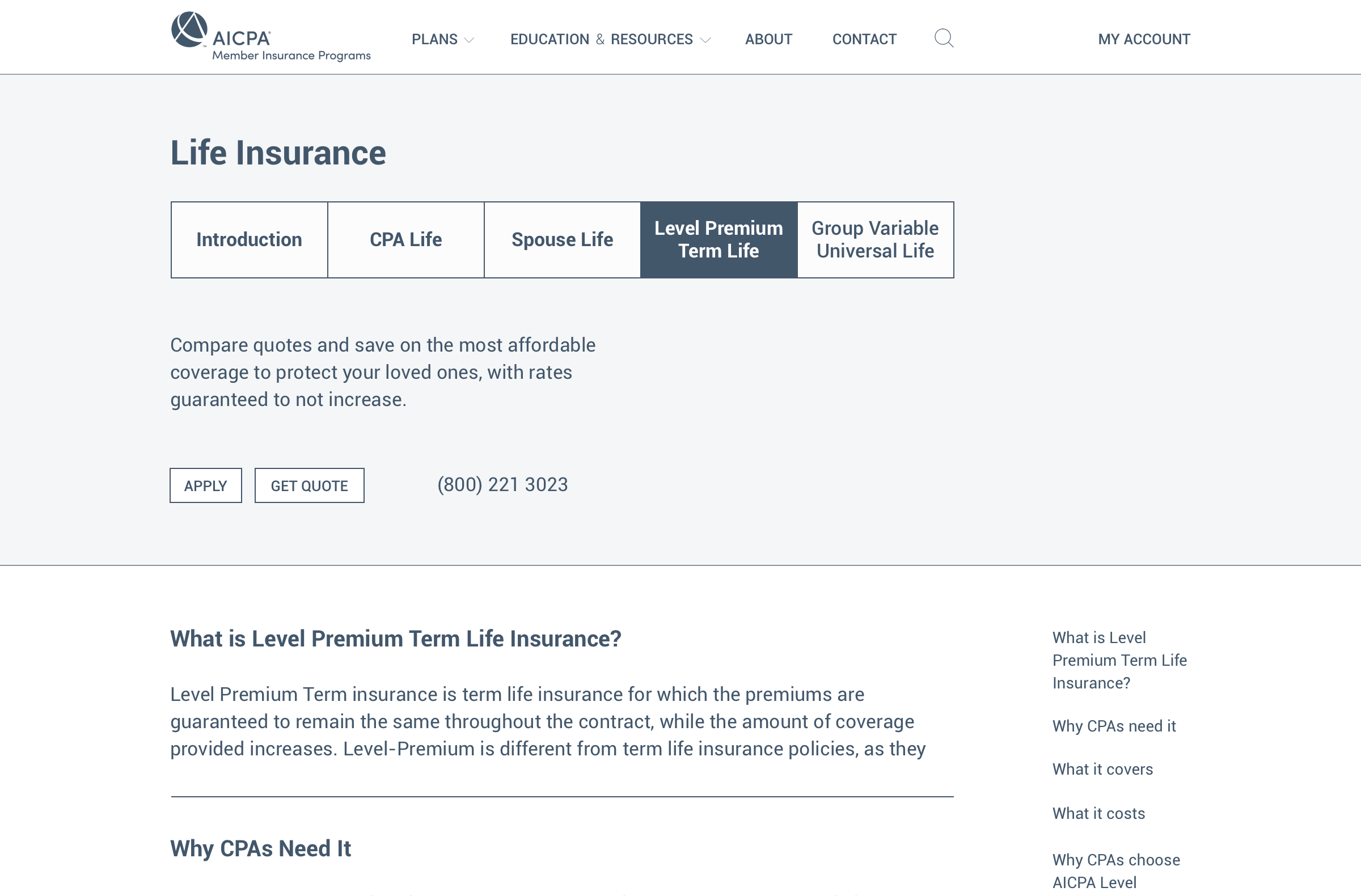
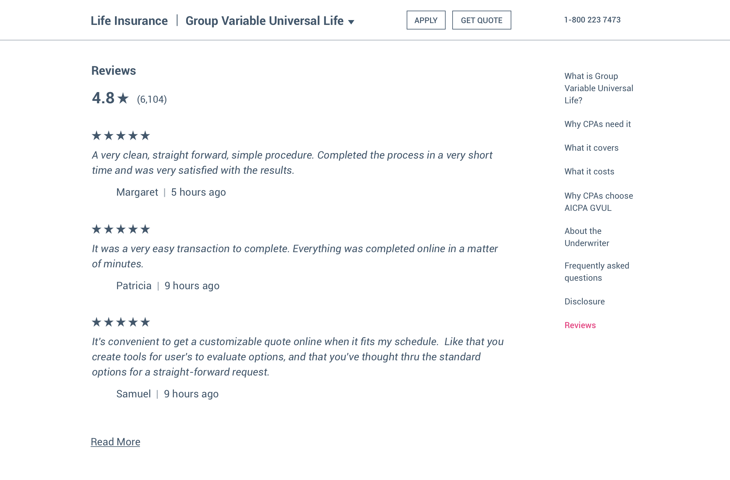
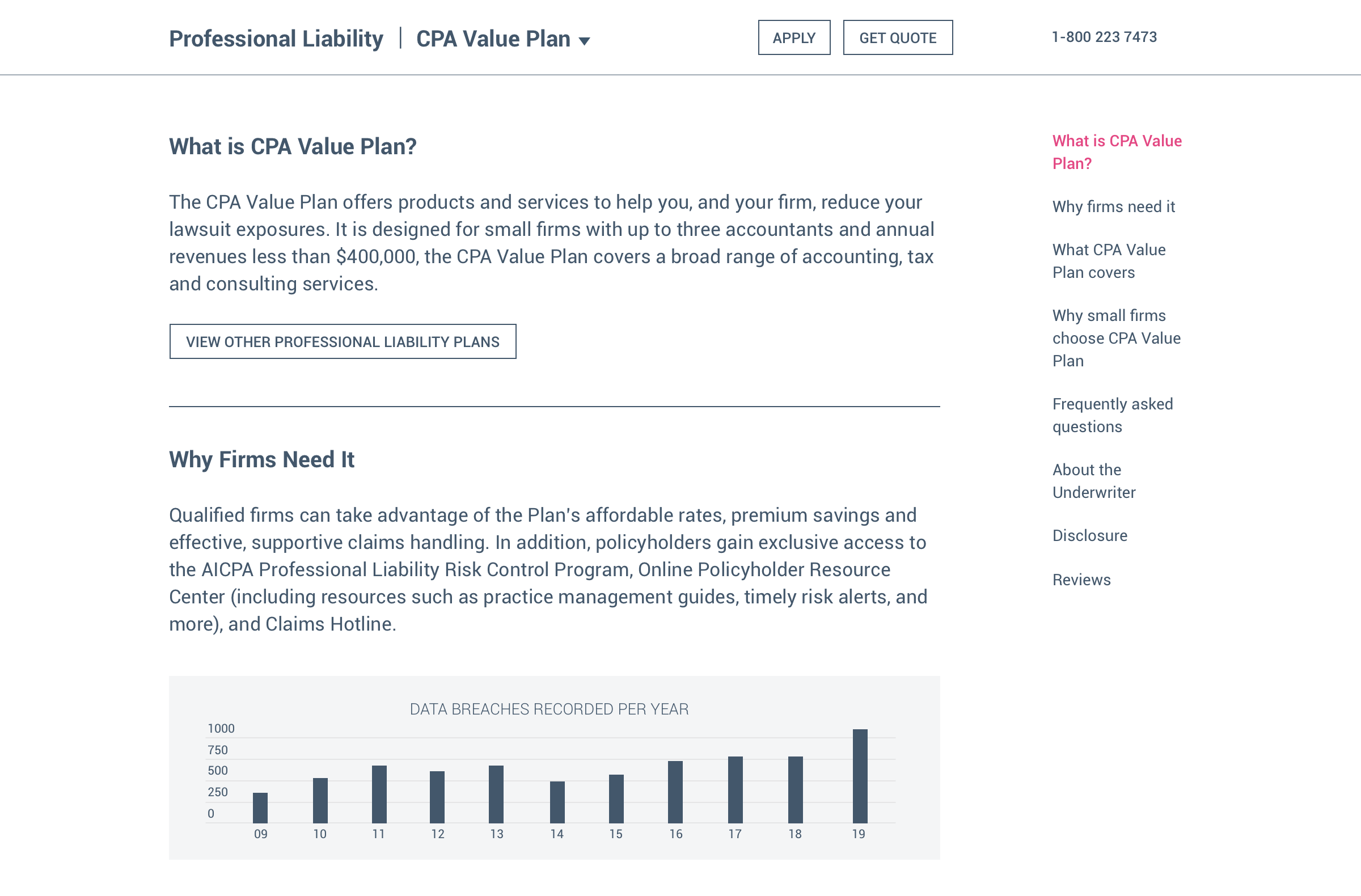
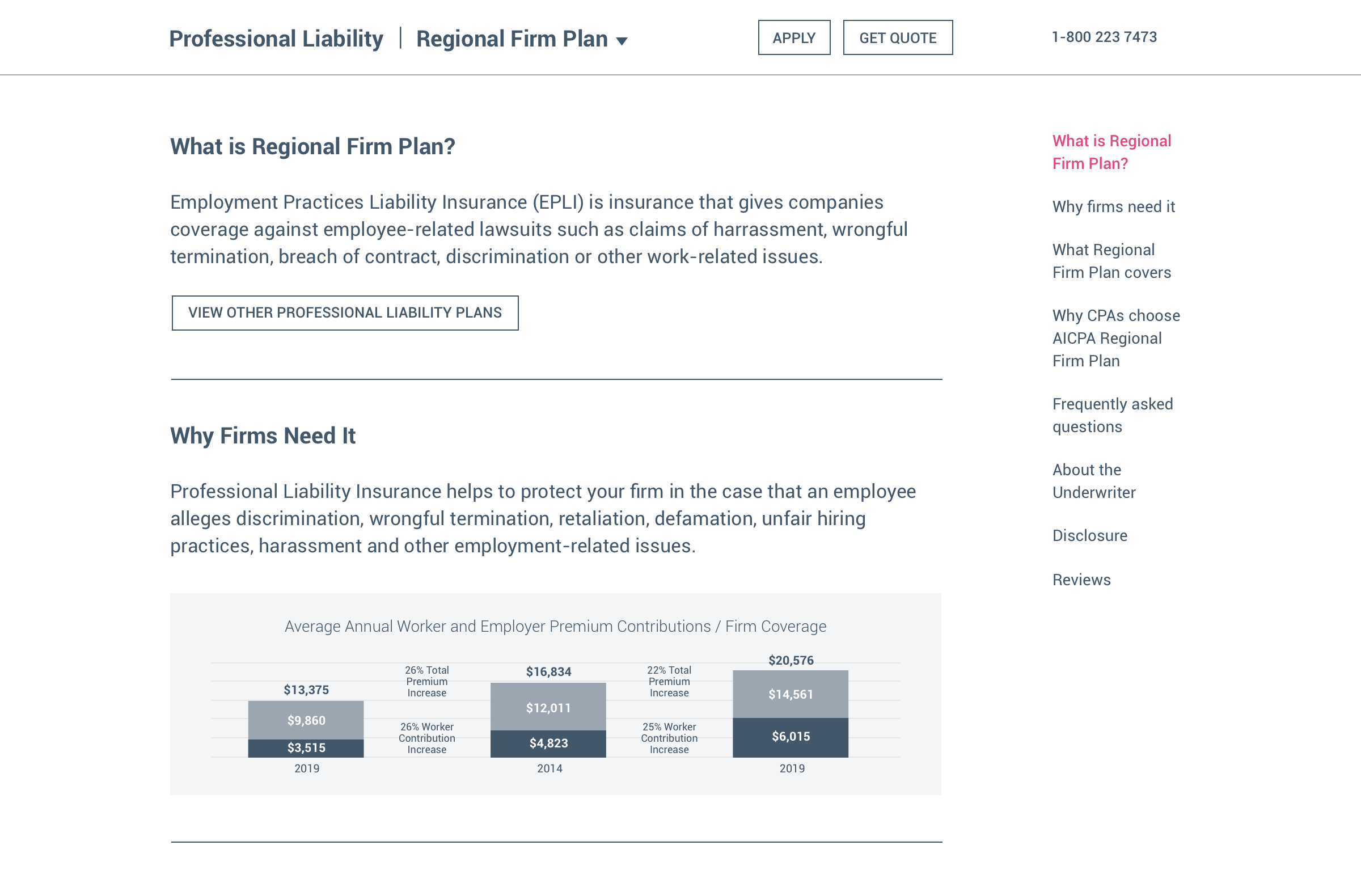
Shortly after completing our mid-fidelity prototype, Phase 2 work on this project was suspended due to covid safety protocols. In the meantime, Aon performed further prototype reviews and testing internally with stakeholders and business groups. After three months, they confirmed that my team's designs fulfilled their needs very well, less some language and marketing copywriting that needed to be refined per brand guidelines. Nevertheless, my team's proposed site architecture, information hierarchy, navigation, workflows, and content strategy remained as we had originally designed, as shown below (desktop view). We coordinated design specs for high fidelity UI and development sprints with their in-house Kentico developers.


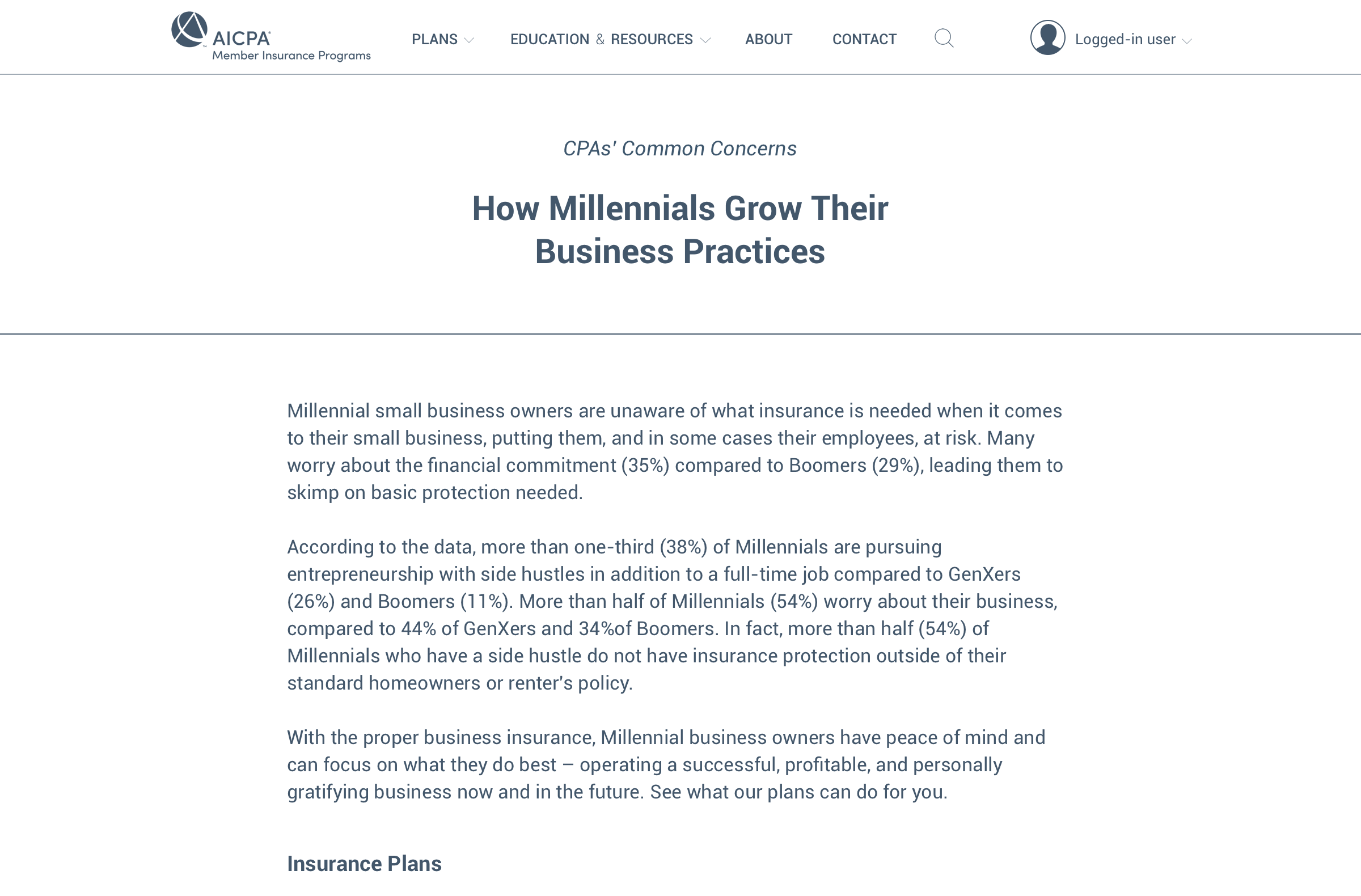
Upon the launch of the new AON | AICPA Member Insurance website, my team was thrilled to see the spirit, character, interactions, and functionality of our designs come to life. Our intent moving forward is to assess site metrics after enough data is gathered. Henceforth, we can continue designing, testing, refining and further building the platform according to our roadmap and new business needs that may arise. Thank you for reading this case study, and stay tuned for updates!